Your Facebook ads’ design is one of the key components that make your campaign either succeed or fail.
When I got started with Facebook advertising around 4 years ago, in all honesty, I had no idea how Facebook advertising works.
Fast forward to 2019, managing millions of dollars in Facebook ads budget has taught me a lot. I’ve digged into Facebook ads big time, and have since contributed tens of articles on this topic to:
Up next, you’ll find the 25 Facebook and Instagram ad design hacks that have sometimes resulted in 200%+ higher CTRs and conversion rates.
Expect to see tons of case studies, A/B test results, and success stories – and apply all of them to your own Facebook ad campaigns.
Read more: 162 best Facebook ads in 2018 and 2019
Want to improve your writing skills as well? Read this guide on copywriting for social media and Facebook posts.
Make sure that all your Facebook ads have the correct measurements by following this guide on Facebook ad size in 2020.
Your Facebook ad design is critically important
A Facebook ad image can make or break your campaign.
Consumer Acquisition found that images are arguably the most important part of your ads — they’re responsible for 75%-90% of ad performance.
If your ad image fails to catch attention, nobody will read your ad copy.
So it’s crucial that you’re constantly A/B testing new Facebook ad designs to find a winning solution.
At Scoro, we’ve tested at least 20 different ad designs over the past 10 months.

Did all those various ad designs really have different CTRs and conversion rates?
They sure did.
Here’s an example of three different Facebook ad design’s performance:


So you better create your first highly converting Facebook ad designs and put them all on trial in a quick A/B test.
And then, once you’ve tested enough ads and applied the best design hacks, boom, you’ve found yourself an ad image that people can’t help but click.
Facebook ad design hack #1:
Use colourful Facebook ad images
If you think about the Facebook newsfeed, it’s full on photos and dull ads.
Creating a colourful ad that pops into people’s eyes is the best way to earn their attention.
And you don’t even need hardcore Photoshop skills to do it. Take a look at this Facebook ad example by OptinMonster – their ad is super simple yet compelling.

Research shows that people make up their minds within 90 seconds of their initial interaction with people or products. About 62‐90% of their assessment is based on colors alone.
If you’re unsure which colour to use, you can:
- Keep to your branded colours
- Choose according to the colour psychology
- A/B test 3-5 different colours
The New York Times is constantly testing new Facebook ad colours to avoid ad fatigue and appeal to more people.

There’s one more thing you should know about colourful Facebook ads, leading us to the next point.
Facebook ad design hack #2:
Use highly contrasted colours
A study by UsabilityTools showed that using highly contrasting landing page call-to-actions resulted in 75% higher click-through rate, compared to a low-contrast CTA.
Higher contrasts help to draw more attention to your ad.
Take Nike’s ad for example. Their contrasting carousel ad immediately catches attention.

Here’s another example by Udemy (notice the contrast between orange and white ad elements).

But sometimes, the contrast you’re looking for isn’t the one between ad elements. You can also create Facebook ads that contrast with the entire newsfeed.
Facebook ad design hack #3:
Create ads that contrast with the entire newsfeed
We once ran an A/B test to see what works best – a colourful red ad vs. an ad with a white background.
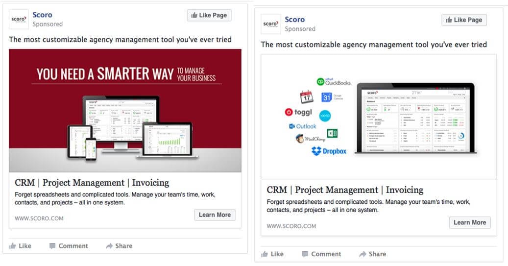
We discovered that the white ad had a 60% higher CTR and attracted 40% more conversions at the same budget.
Sure, there are other aspects that might have contributed to the light ad’s success. However, as we kept using this ad design with new ad copy and CTAs, it returned awesome results for months to come.
Here’s another example by Squarespace. They’ve contrasted white image background with colourful icons, making the ad easy to notice.

So here’s my recommendation: Test creating Facebook ad images with white backgrounds – they’re sure to differentiate you from other Facebook advertisers.
Facebook ad design hack #4:
Add your value proposition in the ad image
If your ad image is the first thing people notice, it makes sense to place your key message right there in the image.
Make sure that the ad image text is short and sweet.
Upwork, for instance, uses the in-ad copy of “Find Your Perfect Freelancer,” placing their UVP in front of the ad viewers’ eyes.

Facebook ad design hack #5:
Keep your in-image copy short
Facebook doesn’t like ad images with too much copy on them and will start to limit your ads’ reach if they’re heavy on copy.
Instead of getting a “Yes” or “No” from Facebook, your ad’s text density will fit into one of the four classifications:
- Ok
- Low
- Medium
- High
You can test your ad’s classification by using Facebook’s Text Overlay Tool.
The good thing is that Facebook sends advertisers email notifications, guiding your attention to text-heavy ads.

Facebook ad design hack #6:
Use creatives that spark emotions
I bet you’ve never thought about using ad images that make people emotional, especially if you’re in B2B business.
However, there’s plenty of evidence to make you re-consider.
An analysis of 1,400 successful ad campaign case studies found that campaigns with purely emotional content performed about twice as well (31% vs. 16%) as those with only rational content.
There’s really no limit to the emotions you can bring into play – excitement, melancholy, happiness, sadness, surprise, etc. Just make sure the emotion matches your ad’s offer.
Eventbrite’s colourful ad image shows people at a concert, sparking the emotions of fun and belonging. This trend can also be noticed in many Instagram ad examples.

Trend Hunter Marketing analyzed 55 emotional marketing campaigns, and found the average popularity score to be 8.0 — higher than in other campaign categories.
The next time you’re adding new ad designs to your Facebook campaigns, consider testing an emotional image.
Facebook ad design hack #7:
Use the right image size
Make sure that your Facebook ad design is at least 1200 x 628 pixels wide (the standard size), and that the colors look solid on all screen types.
While Facebook also allows advertisers to upload images in different sizes, following the guidelines is a surefire way make your ads look good on every screen.
Facebook ad design hack #8:
Use symbols to your advantage
Studies show that people rely on emotions, rather than information, to make brand decisions. As you include a symbol in your ad image, people will associate your brand with the symbol’s meaning.
Here’s my favourite example by Sumo. Their ad displays a growth chart, and that’s exactly what their product helps to achieve – increase your website traffic.

SaneBox’s Facebook ad uses Gmail icons so that people will immediately associate their product with email.

But that’s not the only reason SaneBox is using the Gmail icon. They’re also benefitting from the fact that people recognize a popular brand that they already trust.
Facebook ad design hack #9:
Include well-known concepts and logos
Remember when I told you about our light Facebook ad that performed extremely well?
Another reason it might have brought a high ROI is that it included many popular brands logos: Dropbox, MailChimp, iCal…
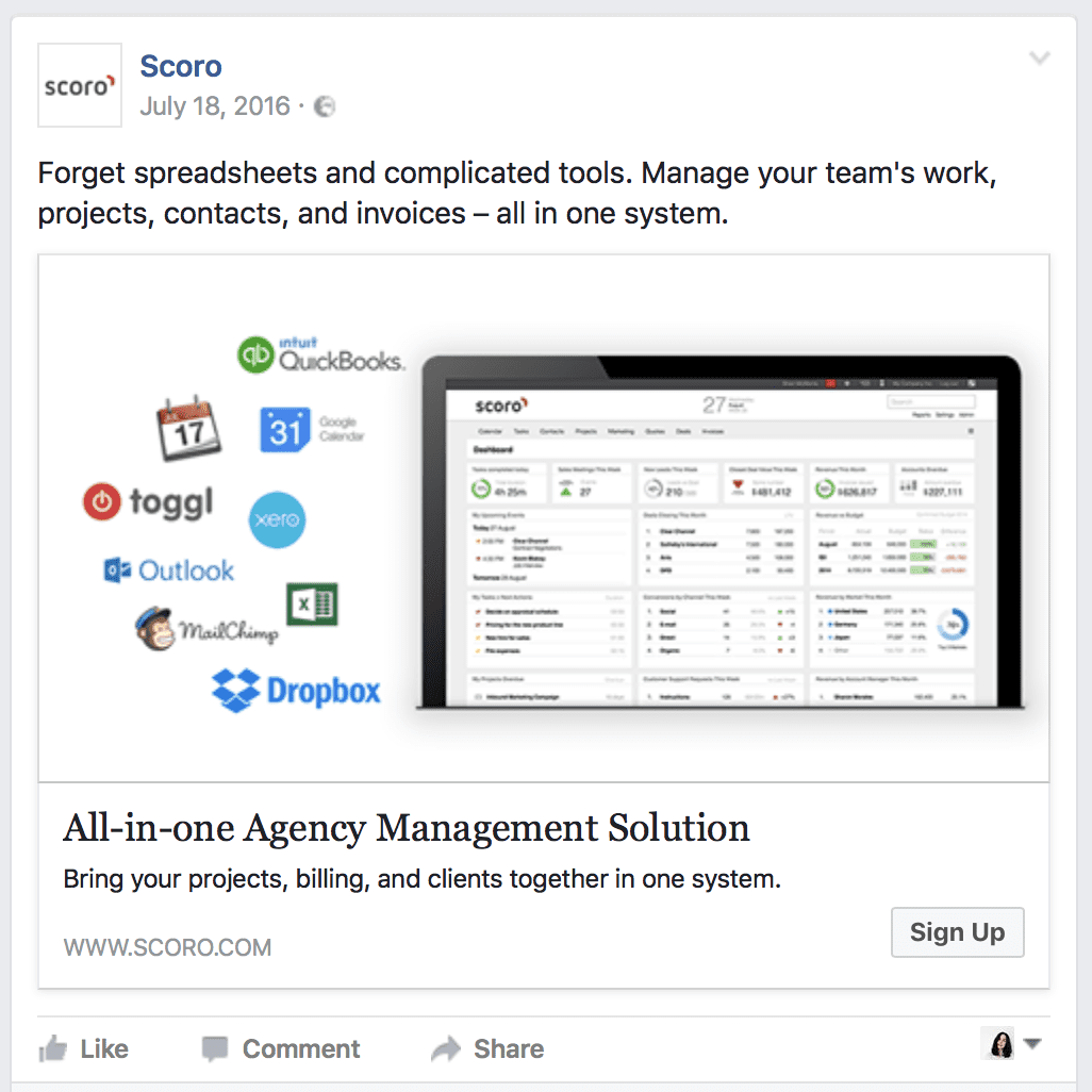
Studies show that our brains prefer recognizable brands. If your product has integrations with other popular tools or you collaborate with a well-known brand, show it in your Facebook ads.
Here’s another smart example by 123 Reg that uses WordPress’ logo in their ad design.

Tip: When running a Facebook App Install ads campaign, include the App Store icons in your ad image to indicate you’re promoting a mobile app.
The simple Facebook ad hack of using well-known logos is hardly used. Test it out and be among the first to benefit.
Facebook ad design hack #10:
Make ad designs personal with hero shots
According to research by Psychological Science, seeing a smiling person makes us feel happy, comfortable and safe.
Don’t limit yourself to using hero shots on your landing pages. Try replacing your current Facebook a design with a picture of a happy customer.
Marketing Experiments shows that using a real person associated with your product instead of a stock photo can increase conversions by 35%.
Here’s an example by WordPress, featuring an image of a happy user.

Facebook ad design hack #11:
Mix hero shots with a short ad copy
If your hero shot takes up only part of your Facebook ad image, add some copy on the other side of the image.
According to Design Shack, captions get read 200% more than body copy so you
want to make the most of them.
Facebook ad design hack #12:
Show your product in action
People usually like to see what they’re buying. So it makes a lot of sense to include your product on your ad.
A study by the University of Iowa compared our hearing memory to the visual memory. We’re hardwired to remember things we see much longer compared to things we hear.
To make people remember your products, place them in your ad image, just like NARS Cosmetics has done:
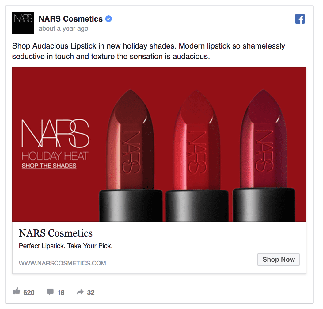
Showing your product in the ad images is beneficial in many ways:
- People can immediately see whether they like your product
- If your product looks nice, more people will click on your ads
- People start to imagine themselves using your product, making them more likely to purchase
- It helps adjust people’s expectations to what they’ll see on your landing page
- It helps to increase brand awareness
You don’t need to have a physical product to showcase it in your Facebook ads. An online product can look just as good. Take Pipedrive’s Facebook ad, for example:

Facebook ad design hack #13:
Show the “before and after”
If your product needs to be unpacked or prepared in some way or another, you can include both of the phases in your Facebook ad.
Showing the before and after is highly engaging as it makes people’s brains put together the full story. With this one simple Facebook ad hack, you’ve turned your offer into a story.
Take a look at this Facebook ad example by Plated. It tells a story of receiving a subscription package and cooking it into a delicious meal.
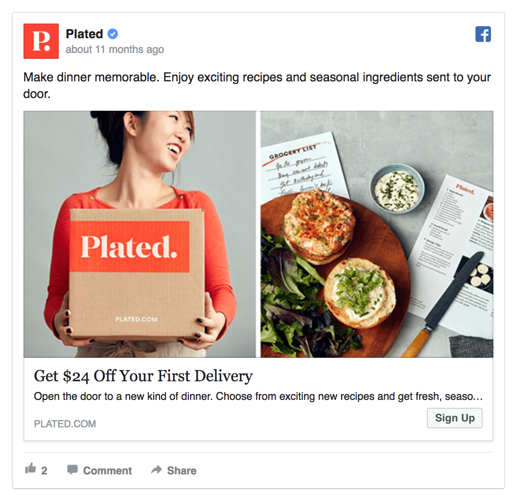
The “before-and-after” technique follows George Loewenstein’s “information-gap” theory proved in the ‘90s: The curious individual is motivated to obtain the missing information to reduce or eliminate the feeling of deprivation.
If you show the before and after images, people will spend more time engaging with your ads while their brains develop the missing parts of the story.
However, not all “before and after” ads get approved by Facebook. According to Facebook’s Advertising Policies:
“Ads must not contain “before-and-after” images or images that contain unexpected or unlikely results. Ad content must not imply or attempt to generate negative self-perception in order to promote diet, weight loss, or other health related products.”
Facebook ad design hack #14:
Tell better stories with carousel ads
A report by Kinetic Social says that carousel ads are 10 times better at getting people to click through compared to static sponsored posts on Facebook.

While I’m not 100% convinced that carousel ads’ ROI is really 1000% higher that that of regular ads, this ad type can help you increase the CTRs to some extent.
Carousel ads let you add up to 10 successive offers to showcase your product or tell a story.
Hired has used the carousel ad format to make their Facebook ad appeal to a number of developers.

Facebook ad design hack #15:
Use carousel ads to show process
If you’re working in a SaaS company, you can set up a carousel ad that shows the various steps of your sign-up process.
If you’re offering a subscription service, you could guide people through the subscription and delivery phases.
How to create awesome carousel ads that get clicks:
- Tell a consistent story throughout the slideshow
- Make your ad’s first slide so good people want to see the rest
- Include a clear call to action (Get, Try, Learn, etc.) under each slide
Facebook ad design hack #16:
Make sure your creatives are unique
If you’re working with tens of different ad designs over a short period of time, ensure they all look trustworthy and high in quality.
Never compromise high quality over quantity.
One stellar Facebook ad image can be worth 10x more than five low-quality images. Take MailChimp’s ad, for example:

Avoid using stock photos, especially the free ones. People are tired of seeing the same images in their newsfeed over and over again.
Facebook ad design hack #17:
Use a colour overlay to create a branded look
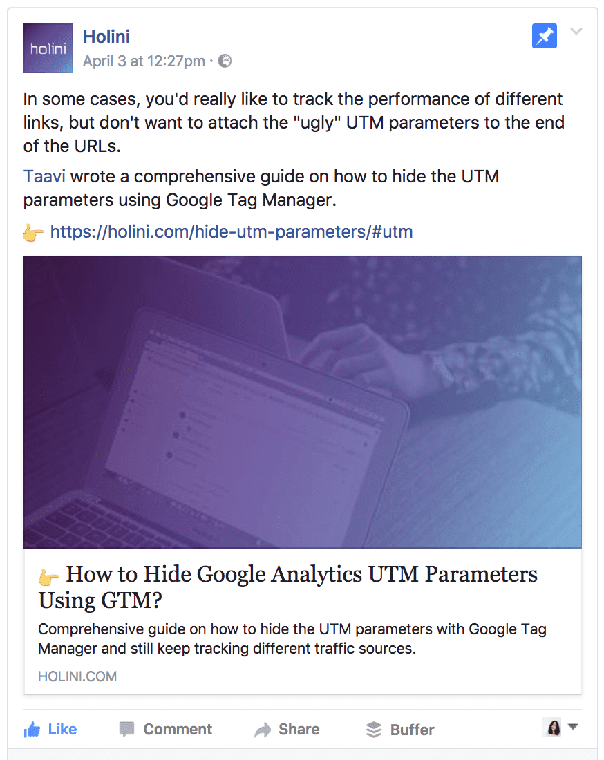
If you’re looking for a quick way to create Facebook and Instagram ad designs that differentiate you from the rest, use this hack from Holini.
They always add a light purple layer over their blog images. This way, their content’s easily recognizable and they can use free stock photos as the background layer.
Facebook ad design hack #18:
Be consistent with your ad designs
If you want to get the benefit of increased brand recognition in addition to sales, try to keep your ad designs consistent over time.
This doesn’t mean that you can’t test various colours or different image types. However, try to keep at least some ad elements in place.
- If you want to test different background colours, keep the fonts and foreground the same
- If you’re planning to test animated images vs. stock photos, keep the colours close to those on your website
- If you’re testing various in-image messages, keep the background unchanged
For example, Marketo always uses their branded colour purple in creatives:

AdEspresso’s Facebook ads always feature their brand mascot, making the ad image instantly recognizable in the newsfeed.

NewsCred’s study found that 62% of Millennials feel that online content drives their loyalty to a brand. The most important driver of brand loyalty for Millennials is a great product at 77%. That’s followed closely by brand recognition and trust at 69%.
Making brand recognition one of your Facebook advertising goals will pay off in the long term as people get increasingly used to your products.
Facebook ad design hack #19:
Match your ad designs with landing pages
If you clicked on an ad featuring a delicious ice cream and then landed on a website selling dog food, you’d probably feel quite negative about the deceiving ad.
Getting people to click on your ads is only half the victory. You also need to get people make a purchase on your landing page.
As we matched our ad designs closely with our landing page, we saw the conversion rates go up by 20-35%.
Here’s an example of the Facebook ad images we used:

Notice how the ad’s background matches exactly with the landing page:

There are other great examples out there. Take a look at Thistle’s Facebook ad and landing page:
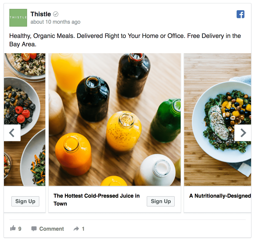

Don’t forget to also match your ad offers with landing pages to increase the conversion rate.
Facebook ad design hack #20:
Replace static images with video ads
When analyzing the ROI of video ads, Kinetic Social found that video ads have the lowest eCPC, with an average eCPC of $0.18.
We’ve tested Facebook video ads in Scoro and there are a couple of key learnings I’d like to share with you:
- The first 5 seconds are the most important ones – you need to immediately catch people’s attention so that they’ll watch the rest of the video.
- Videos work well with complex products, giving you a chance to explain all your product’s benefits
- Adding captions to your video increases the view rates. According to Facebook, captioned video ads increase video view time by an average of 12%.
You can either promote a video of your product or share branded video content like Adidas has done:

Tip: Keep your videos short – Wistia discovered that on average, people watch more than 80% of a video shorter than 30 seconds. However, as the video length increases, the engagement drops.
See these 21 Facebook video ad examples for tons of inspiration.
Facebook ad design hack #21:
Include discount offers in your ad image
If you’re running a Facebook or Instagram campaign offering a discount, make sure that people notice the offer as soon as possible.
For example, MOO’s Facebook ad has a large yellow “25% off” sign right in the ad image, making their offer clearly visible.

How to create better discount offers for your Facebook ads:
- Promote limited-time offers, flash sales, limited-stock items, etc.
- Define clear dates, e.g. “Today only” or “Offer ends in 24h” to create a sense of urgency
- Offer a substantial discount, e.g. “Get 25% off today”
- Match your advertisement’s offer on your landing page
- Place the discount offer in your ad’s headline or the image
Facebook ad design hack #22:
Include a straightforward call to action
While A/B testing Facebook ads at Scoro, we discovered that the ad with the “Sign Up” CTA outperformed the ad with the “Learn More” CTA by 14.5%.
There are mainly two reasons for that:
- The “Sign Up” CTA matched the offer on our landing page
- People who clicked on the “Sign Up” CTA were more willing to sign up than the ones who just wanted to learn more
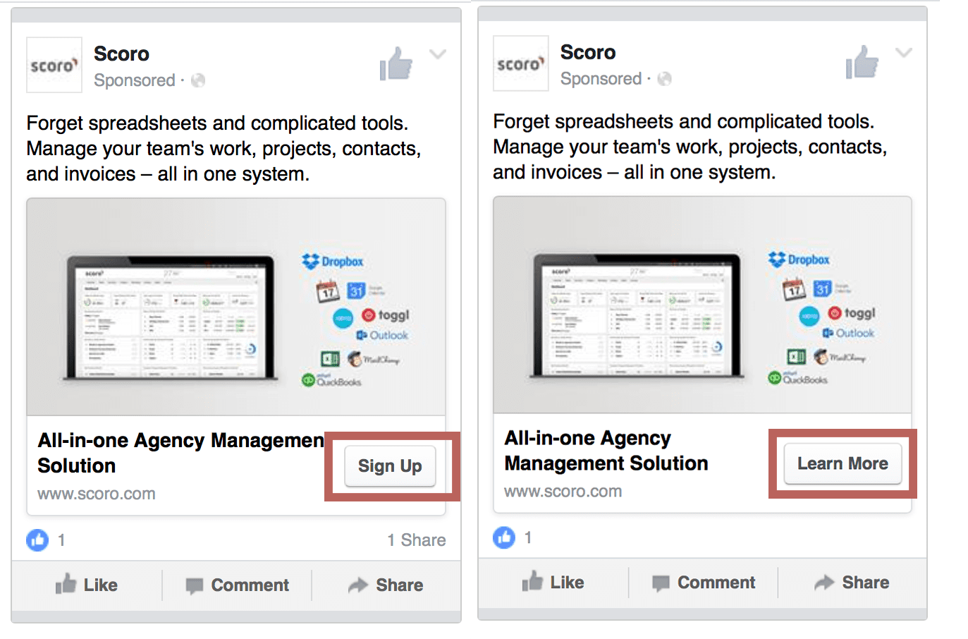
When creating ad designs, don’t lose sight of your final Facebook advertising goal – conversions. While people are more likely to click on low-threat CTAs such as “Learn More”, they’ll actually convert at a higher rate after having clicked the “Sign Up” CTA.
Test adding the call-to-action in your ad image to draw more attention to the action you’d like the ad viewer to take. Here’s a nice example by LinkedIn:

Facebook ad design hack #23:
Use GIFs instead of images
Earlier in 2017, Facebook announced that it’s now letting advertisers use GIFs as ad image.

As there are still many people who have no idea about this, you can use this Facebook ad hack to your advantage.
In fact, Buffer’s put together an awesome guide on creating your own GIFs.

How to create a Facebook ad with an animated GIF:
- Create a Facebook ad campaign in the Ads Manager
- Instead of selecting your ad’s image, select a GIF that you can upload to the Videos section
Facebook ad design hack #24:
Create location-specific ad images
There’s a simple rule that applies to all Facebook ad campaigns – the more relevant your ads are to the target audience, the more they’ll convert.
Location-specific Facebook ads take the relevance to the next level.
By mentioning particular cities in their ad images, Lyft’s able to catch more people’s attention. That’s because people will immediately view the ad as more relevant as it mentions their current location.

Mazda created dynamic ads based on geographic radius to target people who are likely to go to a specific Mazda dealership. The results were staggering: Visitors who saw these ads converted at a 53% higher rate than the control group.
Tip: Make sure that your location-specific target audience is big enough to justify the extra time you spend on creating new location-specific ads.

Facebook ad design hack #25:
Avoid ad fatigue by rotating ads
Imagine you log in to your Facebook Ads Manager account and notice that your campaign’s performance is down 50% from two days before.
What happened?
This scary marketers’ nightmare is called the Facebook ad fatigue – the moment when your target audience gets tired of seeing your ads.
AdEspresso’s analysis showed that Facebook ads’ cost-per-click increases by more than 45% on the second ad view and over 120% after a person has seen the same ad 6 times.

So how can you avoid your ad designs becoming old news?
Here’s the secret tactic I like to use with all my customers: we’re rotating our ad designs, so that the target audience will see a different ad design every few days.
Here’s how it works:
- Set up 3-5 ad sets with different ad designs
- Schedule each ad set to be active on different weekdays
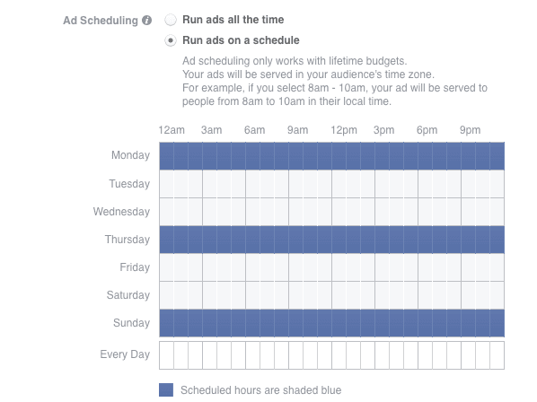
Now, you don’t need to worry about your target audience seeing the same ad design over and over again. They’ll only see each design a couple of times, extending your Facebook campaign’s lifetime by multiple weeks.


