Marketing Fix
BlogAbout & ConsultingMeta Ads ManagementNewsletterAd Examples
Unlock the gallery
BlogAbout & ConsultingMeta Ads Management
Marketing Fix
  • Blog
  • About & Consulting
  • Meta Ads Management
  • Newsletter
  • Ad Examples
Unlock the gallery
FacebookInstagramOriginal ad captures

The perfect Meta ads gallery

By Karola Karlson

Learn from Facebook and Instagram ad screenshots and videos. Copy the visual structure, adapt the idea, and turn it into your next creative test.

253examples live
5industry categories

Last updated 6 November 2026

Explore LinkedIn Ads Gallery→
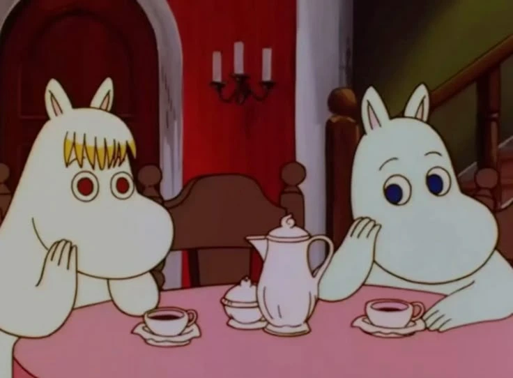
The Snork Maiden and Moomintroll having tea at a pink table
Copy the best. Then make it unmistakably yours.

01

Choose an idea

Find a visual structure that fits your offer.

02

Click "Copy & test"

See why the visual works and get a specific idea to test.

03

Design & test

Adapt the structure to your brand, then launch your own creative.

Static adsVideo ads

50 examples are open to preview. Subscribe below to browse all 196.

Unlock the full gallery
Copy & test

Why it works

The first sentence credits the reader with work they have already done, so the second one reads as help rather than a replacement. A hand-drawn open door with two terracotta shapes illustrates “what comes next” in a calm, human way. Cream space, serif type and a single logo set it apart from busier AI ads.

Idea to test

Open with a line that recognises what your audience has already built, then position your product as the next step. Pair it with one simple drawn metaphor instead of a product screenshot.

Copy & test

Why it works

Instead of one cover, the ad fills the frame with pages from Stocksy's '27 Visual Insights report, so the download looks rich before anyone opens it. Large italic words such as “With”, “For” and “Between” repeat across the spreads and give the collage one rhythm. The photos are Stocksy's product, so every tile doubles as a sample.

Idea to test

Promote a report by tiling its best pages into one image, letting some crop at the edges so the frame feels full. Repeat one typographic device across the pages so the collage reads as one piece.

Karola's work
Copy & test

Why it works

A dozen city names in brand-coloured pills turn “across Europe” into places readers can picture themselves in, from Tallinn to Lisbon. A “Remote” pill in the same cloud covers people who don't want to move. The headline announces the news in four words, and the button repeats that the career agent is free.

Idea to test

When you launch in new markets, list the actual places as labels instead of naming a region or showing a map. Add one option for people outside the list, and keep the headline to the news itself.

Copy & test

Why it works

The discount and the code sit in one line, with the code underlined like a link, so it's easy to remember before tapping. Below, a sample bakery site with an “Added to Cart!” message and order buttons shows the kind of shop people could build. The small print keeps the time limit and terms visible without crowding the offer.

Idea to test

Write the discount and the code as one headline, and style the code so it looks usable. Show a finished example of what customers can make, with a sign of real activity such as an added-to-cart message.

Copy & test

Why it works

PR teams want journalists to open their pitches, so research built on what journalists said is hard to ignore. The headline teases the answer without giving it away, and viewfinder-style corner brackets frame it as something worth focusing on. A SOTM26 badge marks it as this year's State of the Media report, and the button says exactly what you get.

Idea to test

If your research surveys the people your buyers need to win over, lead with that. Tease the finding in the headline without revealing it, and give the download button its own space.

Copy & test

Why it works

Logos of ad platforms, CRMs, warehouses and AI assistants all wire into Funnel's mark in the centre, so the product's role is clear before anyone reads the copy. Pink “MCP” picks out the new idea, and “your AI can trust” answers the obvious worry about letting AI touch marketing data. The cards below add a survey quote and use cases for people who swipe.

Idea to test

Draw your product as the hub between tools your audience already uses, with their real logos. Highlight the one new term in the headline in an accent colour, and use the carousel cards for proof and use cases.

Copy & test

Why it works

The whole workflow fits in one frame: a prompt, a product photo and a logo file connect to a finished lifestyle shot of the cap. Following the lines explains what “node-based canvas” means without a tutorial. A concrete brand task, a seasonal merch mockup, makes the tool feel ready for real client work.

Idea to test

Lay out the inputs and the result of one real task, and connect them so the process reads at a glance. Pick a task your buyers do every week, and make the output image the largest element.

Copy & test

Why it works

The customer result is the headline, from 77 to roughly 890 ads a week, set in plain large numbers. One finished soda ad sits beside a grid of empty dashed frames, so viewers picture the other versions the video is about to fill in. It's a case study told in a single frame.

Idea to test

Lead with a customer's before and after numbers. Show one finished output beside empty placeholders, then fill them in as the video plays to prove the speed claim.

Copy & test

Why it works

The headline names a decision every founder has to make, pricing, and promises a practical answer. Stripe's soft pink gradient and thin layout lines make the ad recognisable without showing the product. A small monospaced “Read our guide” line sets expectations before the Download button.

Idea to test

Write the guide's title as a how-to headline about a decision your buyers find hard. Use your brand's colour or texture as the whole visual, and keep the call to action small and specific.

Copy & test

Why it works

The 3D Snoo sits at a laptop with a mug, a light bulb and a rising chart, so the mascot plays a marketer who has just had a good idea. The headline names a job marketers know well: proving that a channel works. A white “download the guide” pill and a cited case study make the offer clear and the claim easier to trust.

Idea to test

Put your mascot in your customer's role and setting, with the objects they use every day. Write the headline about the result they need to prove, and make the free resource look like a button inside the image.

Copy & test

Why it works

Gold Art Deco frames and lettering tell viewers the period and the genre before they read a word. Nods to the novel reward people who know the story: watching eyes, a dollar sign in the title and the “old sport” invitation. The venue and dates sit at the bottom in large type, so the poster also works as a reminder to book.

Idea to test

Borrow the visual style of the world your product comes from, so the setting is clear at a glance. Add one or two references that fans will spot, and keep the practical details (where and when) large enough to read in the feed.

Karola's work
Copy & test

Why it works

The headline splits the promise into two colours, so “build with AI” stands out as the skill Roleo screens for. A friendly candidate photo with a “Senior Engineer · ships with agents” tag previews the kind of shortlist a hiring manager would get. The small “Roleo for companies” label tells people who know Roleo as a career agent that this ad is for employers.

Idea to test

Put the one skill your buyers struggle to find in a second headline colour. Show a realistic example of the result, such as a candidate photo with a short tag, and label the ad clearly when it targets a different audience from your usual one.

Copy & test

Why it works

Pieces of a ChatGPT ad surround the headline: a user's prompt, a sponsored travel card, a product shot and a beach photo. Advertisers see what the new placement looks like while they read the promise. The four-word headline frames the benefit as a change from curiosity to customers, and the logo line says exactly what is on offer.

Idea to test

When you launch a new format, show its parts around your headline instead of explaining it in copy. Use a believable example brand, label any AI-generated images, and keep the headline to the change you promise.

Copy & test

Why it works

The headline links a better website to Black Friday, a date its customers are already planning for. A yellow swing tag on the headline makes the seasonal angle look like a price label. Below, a sample course page with a colour palette and an “Edit with AI” menu shows how the site gets better, so the AI features read as practical tools.

Idea to test

Link your product to a date your customers are already preparing for. Show a realistic example of their work, such as a shop or course page, with your tool's controls on top, so the benefit and the feature appear together.

Copy & test

Why it works

The headline starts with two things the viewer already has, a LinkedIn profile and a portfolio, and promises to turn them into a brand strategy. A row of AI app icons with Perplexity's in black places the tool beside names people recognise. The caption adds a personal sting: a recruiter-style search didn't find you.

Idea to test

Write a headline that begins with something your audience already has and ends with the result they want from it. Keep the visual to large type and one product cue, and save the sharper personal hook for the caption.

Copy & test

Why it works

The flash-lit night photo makes the reflective dots and logo shine, so the picture proves the main feature instead of just claiming it. Road markings and a street sign place the runner exactly where the kit is meant to be worn. Two short lines in pale lime name the use and the collection without covering the product.

Idea to test

Photograph the product in the conditions it's designed for, and light it so the key feature shows up in the image. Keep the copy to the use case and the product line, and place it away from the product.

Copy & test

Why it works

The composer's name fills the first card in heavy white type, and “at 90” turns the event into an anniversary worth marking. A swirl of glittering particles behind the letters suggests rhythm and movement without a single photo of the orchestra. The arrow and dots invite a swipe to the next cards.

Idea to test

Lead with the one name or milestone your audience will recognise and set it in large type. Add an abstract visual that captures the feel of the experience, and use the other carousel cards for the details.

Copy & test

Why it works

The chart starts with familiar situations, then matches each one to a product. Clear columns and short labels help people choose quickly.

Idea to test

Build a four-column comparison that matches each use case with the right product.

Copy & test

Why it works

The close-up selfie framing looks like normal Stories content. Three bright labels above the creator’s head make the Premium benefits quick to scan.

Idea to test

Film a creator speaking directly to the phone camera. Place three short benefit labels around their face using bold, high-contrast colours.

Copy & test

Why it works

The products sit on a striped pedestal among gold boxes and mirrored ornaments. This makes the free gift set look like an occasion rather than an extra item added to an order.

Idea to test

Stage the special-offer products on a small pedestal. Add wrapping, reflective props or seasonal details that make the set feel gift-ready.

Copy & test

Why it works

The creator’s face fills the frame, making the ad look like native beauty content. Holding the bottle beside her face keeps the product visible while she speaks.

Idea to test

Ask an influencer to hold the product close to the camera and explain why they use it. Keep both their face and the packaging clearly visible.

Copy & test

Why it works

The large black-and-white fashion image creates mood and gets attention. The row underneath turns the campaign look into a product gallery viewers can browse.

Idea to test

Lead with one magazine-style campaign image. Add a simple product gallery underneath featuring pieces from the same collection.

Copy & test

Why it works

One product and one clear message make the launch easy to notice. Extra details do not compete for attention.

Idea to test

Build the ad around one product, one new detail and one direct action.

Copy & test

Why it works

The large €600 gives the ad a strong visual anchor and makes the compensation amount impossible to miss. Big numbers work well in Meta creatives because they turn a general claim into something concrete. The rough plane doodle keeps the legal message approachable.

Idea to test

Make the amount or result the largest visual element. Place the company’s weak response beside it and use a rough illustration or annotation to sharpen the contrast.

Copy & test

Why it works

The close-up shows the serum texture and how it is used. The packshot connects the product to the result, while the “11x faster” claim adds proof.

Idea to test

Show the product in use, keep the packshot visible and add one quantified proof point below the headline.

Copy & test

Why it works

The 75% discount gets attention first. The shorter text then explains what the plan protects. The colour contrast separates the offer from the product message.

Idea to test

Lead with the discount. Explain the protection in one short line and keep the plan length visible.

Copy & test

Why it works

Listing every included product and its value makes the $72 package easy to verify. The $0 total gives the special offer a strong finish.

Idea to test

List every included product with its normal value. Finish with the total value and the special-offer price.

Copy & test

Why it works

The campaign image gives the collection a clear style and point of view. The product catalogue underneath turns that interest into several products to browse.

Idea to test

Lead with one magazine-style campaign image. Add three to five products underneath so viewers can shop the wider look.

Copy & test

Why it works

The art-directed image sells a mood and a complete look, not only one item. Minimal text keeps it feeling like fashion editorial.

Idea to test

Build the ad around one highly styled campaign photo. Let the colour, setting and full look express the collection’s personality.

Copy & test

Why it works

Holding the compact camera in one hand makes its size immediately clear. The warm, styled photograph presents it as part of a creator’s personal kit rather than a technical object.

Idea to test

Photograph the product in a real person’s hand to show its scale. Style the hand and background to match the audience you want associated with it.

Copy & test

Why it works

Showing the app immediately tells the viewer what the advertised product is and does.

Idea to test

Show one recognisable task inside the product interface. Choose a well-designed screen.

Copy & test

Why it works

The large “5,000+” and “€1” make the breadth of the offer and its price quick to grasp. Numbers work well in Meta creatives because they give the eye a clear anchor. The app screen shows where the investing happens.

Idea to test

Make the strongest quantity and price the largest parts of the headline. Place a clean product screen beside them so the number and product stay connected.

Copy & test

Why it works

The red-and-white contrast gives the ad a polished, high-fashion feel. Products stacked at different angles show the range without using a standard grid.

Idea to test

Place several products in a balanced stack. Vary their angle and height, then use one bold background colour to contrast with the packaging.

Copy & test

Why it works

The generous white space and strict type hierarchy make the training look established and professional. The start date and total duration answer practical questions without adding visual clutter.

Idea to test

Use a poster layout with the course name as the main headline. Add only the start date, total time and delivery format underneath.

Copy & test

Why it works

The open calendar and dozens of products make the scale of the curation visible. Displaying full-size items, bottles, palettes and samples around the drawers helps viewers judge the variety before buying.

Idea to test

Open the package and arrange every included item around it. Keep the background simple so the number, sizes and variety of products remain easy to inspect.

Copy & test

Why it works

The portrait makes the accessory part of a distinctive personal style. It feels closer to a magazine shoot than a standard product listing.

Idea to test

Shoot the accessory as part of a strong portrait. Use styling and location to sell the person viewers want to be.

Copy & test

Why it works

“6 weeks”, “one tube” and “€0.30 a day” explain the value before the viewer reaches the products. Big numbers give Meta creatives a strong visual anchor. The four coloured tubes then show the available range.

Idea to test

Stack the duration, quantity and daily cost above the product lineup. Use large type and round the cost to a number that can be understood immediately.

Copy & test

Why it works

The customer quote adds proof in a natural voice. Placing it beside the product connects the claim with what created the result.

Idea to test

Pair one short customer quote with the product or result it describes.

Copy & test

Why it works

The composition treats the clothing as part of a visual idea rather than a plain product shot. This gives the collection a stronger fashion point of view.

Idea to test

Choose one deliberate crop, pose or backdrop that could appear in a magazine. Keep the brand and product secondary to the image.

Copy & test

Why it works

The direct-to-camera clip feels like fashion advice from a real person. “Wish somebody would have told me before” creates curiosity, while the height and size details make the recommendation useful.

Idea to test

Ask an influencer to share one thing they wish they had known before buying. Add their height and size on screen so viewers can judge the fit.

Copy & test

Why it works

The open wash bag makes the travel use case obvious before the copy is read. Bright blue packaging and the jet-lag headline connect the set to a specific moment: skincare while travelling.

Idea to test

Place the product inside the bag, desk or kit where people would really use it. Add one short line naming that occasion.

Copy & test

Why it works

The route data sits on top of the real activity. This connects the app’s numbers with the experience they describe.

Idea to test

Place one useful product metric over an unexpected real-world use case.

Copy & test

Why it works

The large film still shows the visual style the products can create. The product gallery underneath presents several packs as clear, shoppable options without interrupting the main image.

Idea to test

Use one large example of the finished visual at the top. Add a product gallery underneath showing the packs, presets or tools used to achieve similar looks.

Copy & test

Why it works

The large “FREE” headline gets attention, then the layout shows the shaker, T-shirt and delivery separately. Crossed-out prices make the value of the special offer easy to check.

Idea to test

Place the main product on one side and list each included item on the other. Show the normal value beside every item and cross it out clearly.

Copy & test

Why it works

“Become a Content Creator” gives the ad a clear outcome. The Adobe partnership, home-learning image and three blue benefit labels explain what the course is and how it fits around daily life.

Idea to test

Name the role or outcome in the largest type. Add the partner logo, a realistic learning image and three practical details such as format, certificate and schedule.

Copy & test

Why it works

The tray of drinks shows a group order immediately. The image and CTA point to the same action.

Idea to test

Show the full group order so the use case is immediate. Use a matching order CTA.

Copy & test

Why it works

The offer percentage appears inside a partly filled bar. The product sits on the bar, with seasonal leaves beside it.

Idea to test

Show your offer percentage as a progress bar. Place the product on top and keep the headline underneath.

Copy & test

Why it works

The familiar meme makes the student budget problem easy to understand. The two-panel story connects the joke directly to Burger King.

Idea to test

Use a familiar audience meme. Connect the final frame to the product and add one clear price message.

Copy & test

Why it works

The close product image makes the free reward easy to see. The headline states the offer, while the smaller text explains the condition.

Idea to test

Link a free-product offer to a current event. Put the reward in the headline and the condition in smaller text.

Copy & test

Why it works

The creator holds the sachet close to the camera and speaks from a real home setting. The caption adds concrete details such as one sachet a day and 11,000 mg of collagen.

Idea to test

Ask an influencer to demonstrate one daily use. Show the pack close up and add one concrete detail about the dose, ingredient or routine.

Subscriber access

Unlock the full gallery.

Subscribe to the Marketing Fix newsletter for all 253 static and video ad examples and their creative notes. It's 100% free. The full-gallery link is emailed to subscribers.

Marketing Fix newsletter

Get the full swipe file

100% free. Unsubscribe at any time.Open Substack
Already subscribed? Unlock with your email

© 2026 Marketing Fix

  • Blog
  • About & Consulting
  • Meta Ads Management
  • Ad Examples
  • Guest posts
  • Marketing Fix newsletter
  • Contact
  • LinkedIn