
This article first appeared in the Marketing Fix newsletter by Karola Karlson (me). Subscribe here for a bi-weekly (Fridays) delivery of hands-on marketing tactics based on 12y of growth roles in 50+ tech companies in the EU, UK, and US.
If you’re running paid ads, your creatives are the number one thing that decides your success. (By success, I mean ROAS and revenue, not impressions and clicks.)
Number two is something you’ve barely touched since the last rebrand: your website header.
You get the click. Fine.
But what’s the website conversion into leads and paying customers?
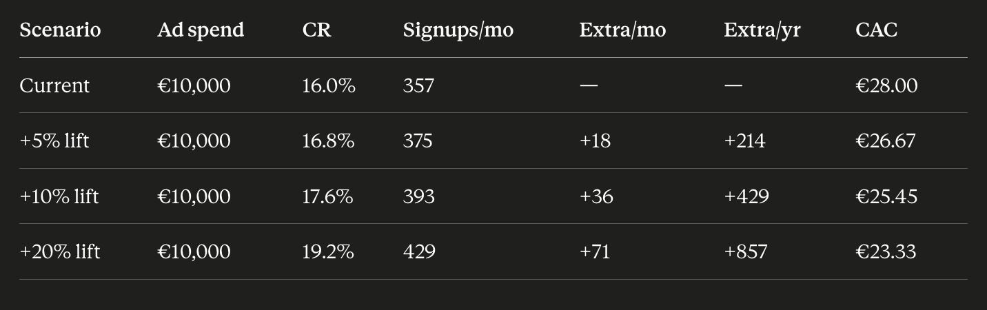
Quick maths: if you spend €10,000/month on paid ads and your signup CAC is €28, improving your website conversion rate by 20% buys you 71 extra signups a month.
That’s €24,000 a year in signups you didn’t have to pay for. Or a 20% bump in new users for the same ad budget.
Read more: 95 Marketing Audit Questions: Free Checklist
But here’s where most marketers get it wrong.
They redesign the entire website to improve the conversion rate.
Nothing below the fold matters. Unless your header gives people a reason to scroll.
Visitors judge your website in 50 milliseconds.
That’s 2.5x faster than a blink of an eye.
It is your website hero that decides whether people will sign up and buy.
In the previous issue of Marketing Fix, I analysed the hero copy of 15 category-defining AI products.
I promised the design half next, so here it is.
Light vs. dark, product UI vs. illustration, and the mystery of the disappearing stock photo. And because looking at pretty websites fixes nothing, each finding comes as an actionable test you can run on your own header this week.
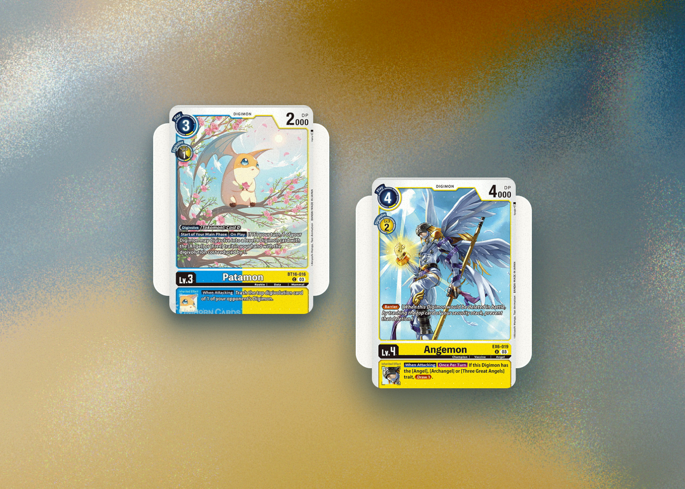
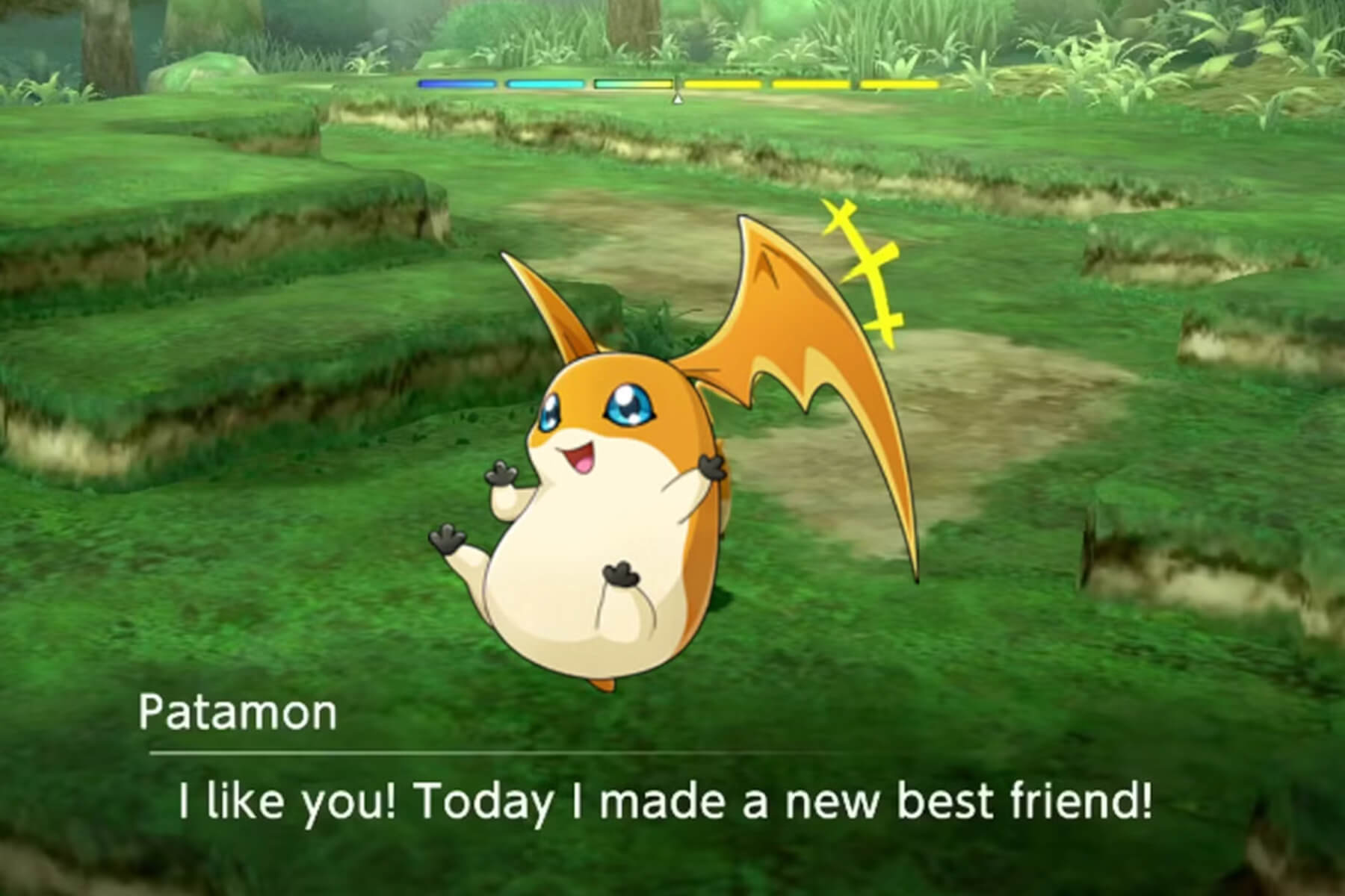
So that your website header can digivolve from Patamon to Angemon.

Six AI-era website header design trends
The 15 AI brands I analysed employ some of the best design and marketing minds money can hire. Which makes their headers less “inspiration” and more free R&D.
Here’s a quick overview of six key trends in AI brands’ website headers.
- Bin the 50/50 layout. Choose a single focus point.
- Ditch the white default. Pick your own mood.
- Forget Inter & Helvetica. Go for a human serif.
- Stop asking for the click. Let visitors try the product.
- Cut the stock photos. Go bare or baroque.
- Change the hero weekly. Keep the logo bar sacred.
Each is worth a copy-and-run test.
Let’s take a look at what each of these means in practice, and how you can turn them into A/B tests for your own website.
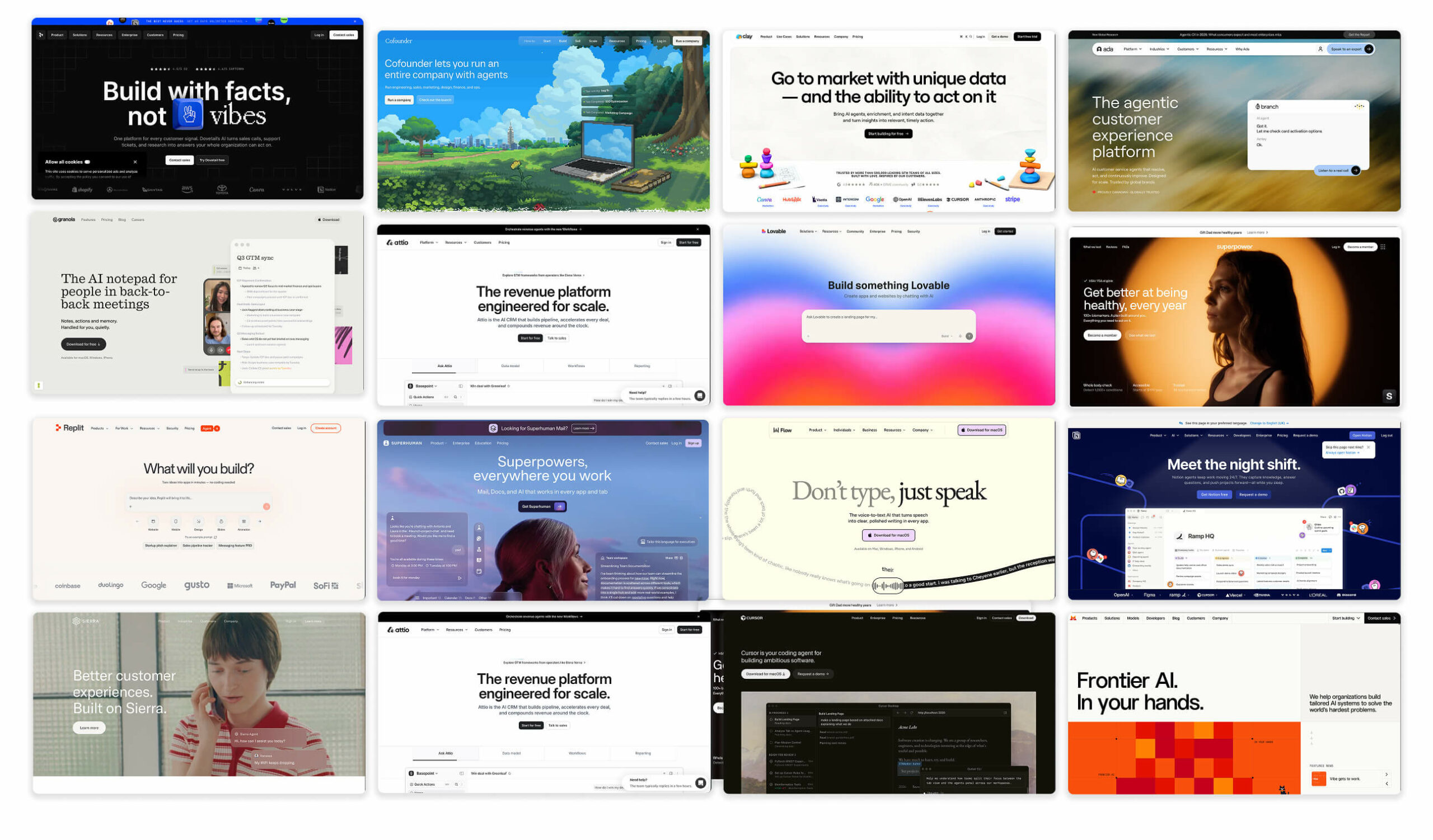
1. Single focus point » Headline 1
Examples: Wispr Flow, Dovetail, Clay
Back in 2016, website headers balanced headline and image equally.
In 2026, all good marketers know that 80% of visitors are on their smartphones. Just check your paid ads traffic and placements.
This means that you’ll have to choose one thing to show first: image or message.
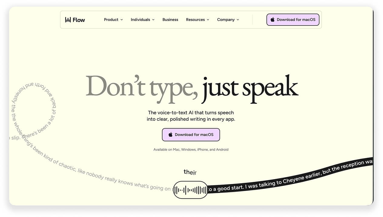
Nearly all (13 out of 15) leading AI brand websites have their Headline 1 blown up to poster size.
But some have also completely omitted the illustration. Unthinkable in 2016!
Wispr Flow states their USP with only a whisper of decoration around it.
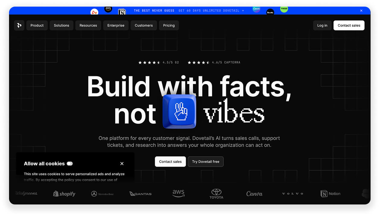
Dovetail makes the headline physical with a 3D finger.
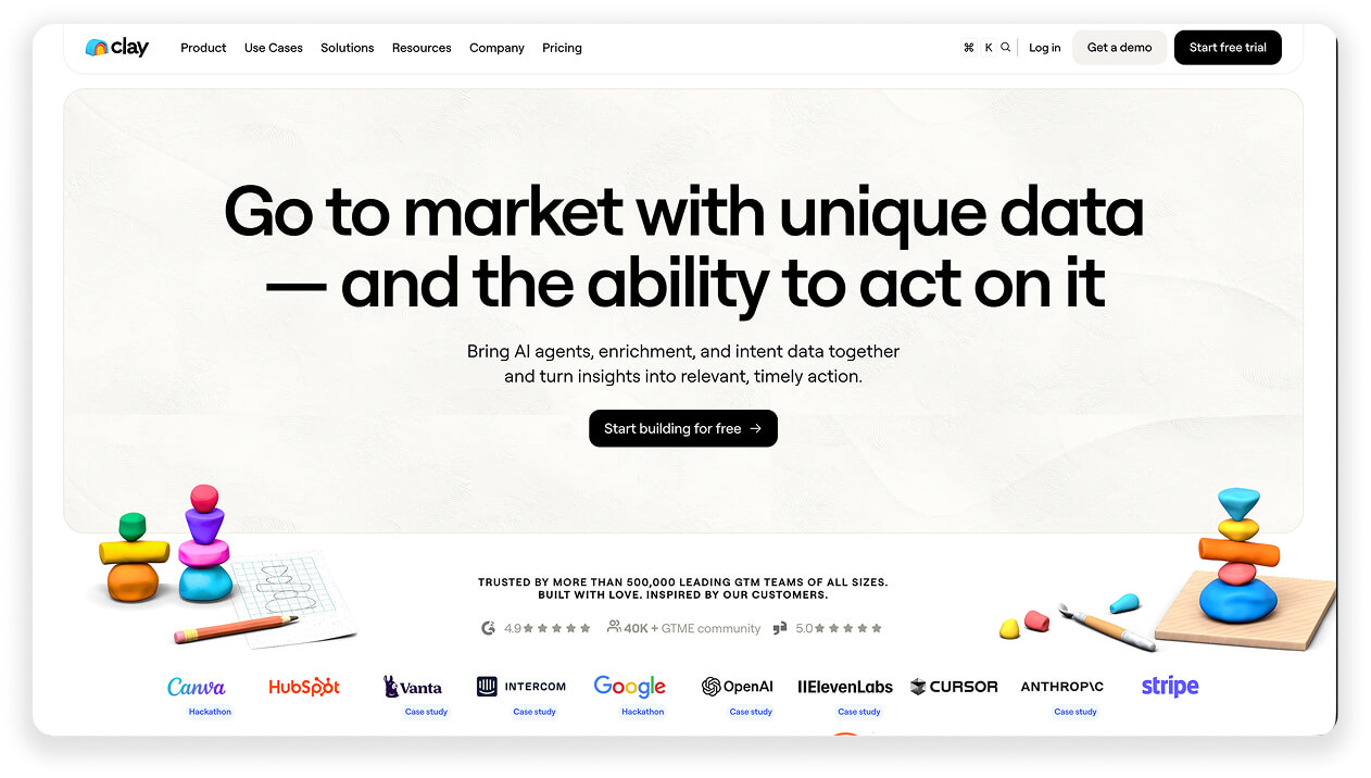
Clay runs a two-line statement over quiet toys-on-white.
How to implement this on your own website:
Promote your headline, demote everything else. Try removing all illustrations from your header.
Make your headline follow one of these proven angles:
- Promise an irresistible outcome: “Get better at being healthy, every year” (Superpower)
- Build in a tension: “Build with facts, not vibes” (Dovetail)
- Keep it readable in one breath (5-6 words): “Meet the night shift” (Notion)
Read more: Copywriting for Facebook and Social Media – How to Make Sentences Make Sense
2. White background » Hued or dark
Examples: Notion, Granola, Superhuman
A white background can look clean, trustworthy, and Apple-adjacent. For many people, it also looks half-baked and pre-seed.
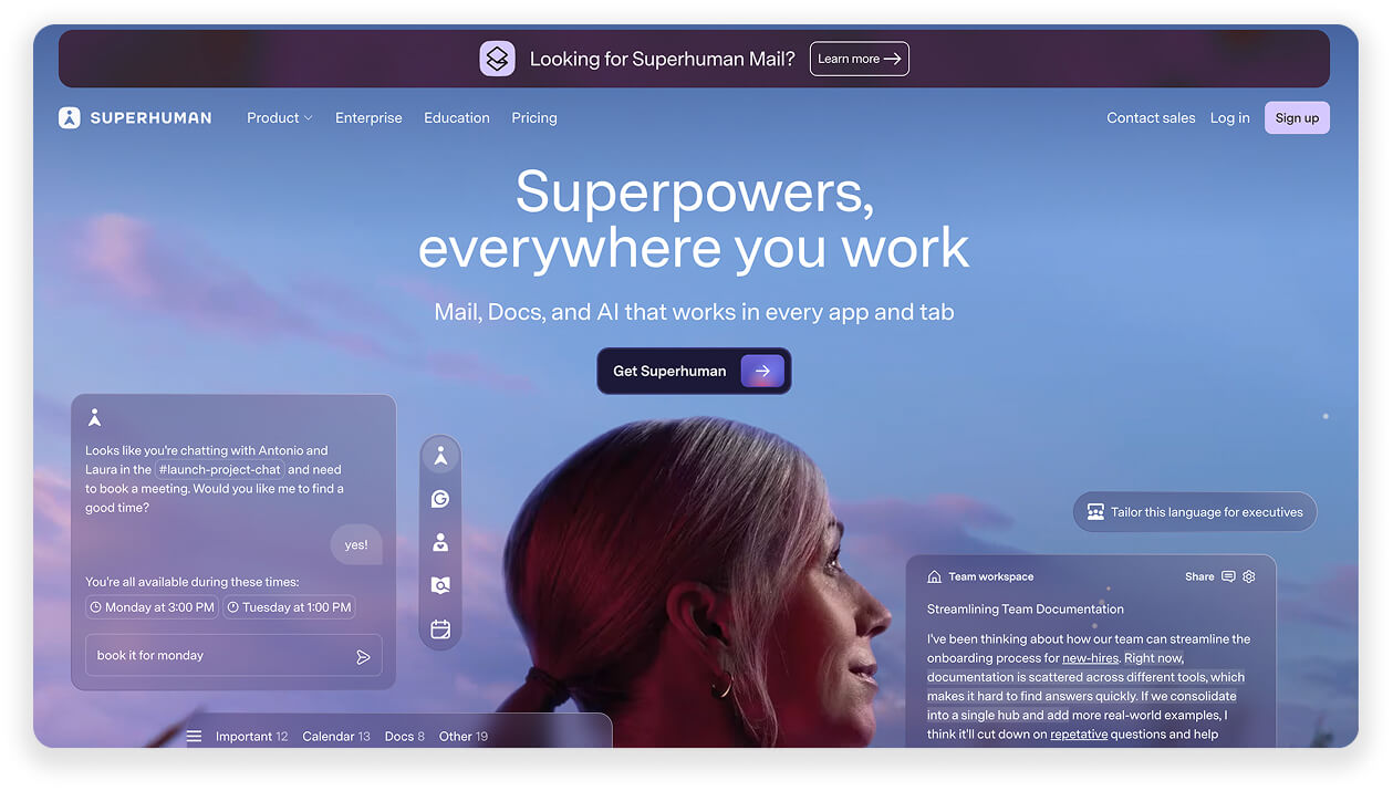
Another trend past its shelf life is the gradient. Only two of the 15 still pull it off: Lovable and Superhuman.
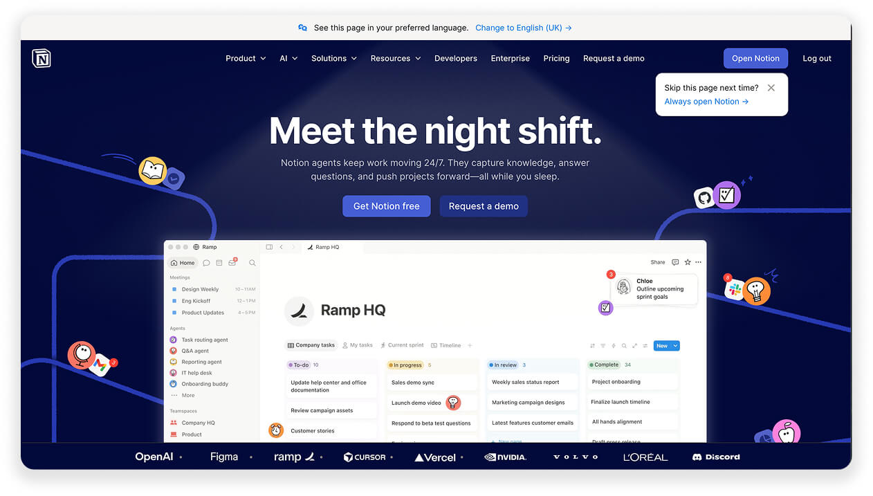
Half of the 15 analysed brands turned the lights off completely: dark heroes from Superpower, Dovetail, Notion, Cursor, Superhuman, and Sierra.
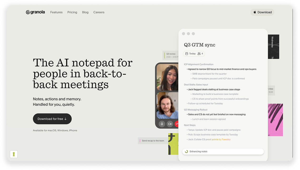
The light half didn’t always keep white either. They swapped it for cream and paper tones.
Notion paints its “Meet the night shift” hero in actual night-shift navy.
Granola sets its AI notepad on a soft cream that reads as paper.
Superhuman’s purple is the bolder of the two surviving gradients.
How to implement this on your own website:
Pick a background that matches your ICP’s mood. Tranquil vs. techy vs. experimental.
- Dark = technical, premium, serious (works for dev tools and pro software)
- Cream and paper = calm, human, editorial (works for anything claiming to simplify work or life)
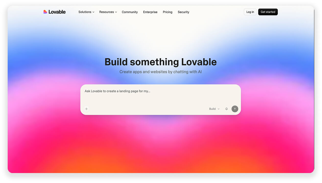
- Gradient = statement. Only if you commit like Lovable’s pink-blue.
Whatever you pick, ensure high text-background contrast first. Dark heroes win design awards and lose conversion tests.
3. Sans » Serif fonts
Examples: Wispr Flow, Ada
I think the sans » serif font change is the best recent UI hack I’ve seen. It immediately creates a classy and elegant feel.
What’s even better: It’s a new trend that most SaaS brands have yet to catch up with. Change now and be among the avant-garde.
Sans serif fonts (Inter, Helvetica, etc.) are safe and neutral. They’re also invisible and identical to everyone.
The taste-signalling AI brands break rank in two directions.
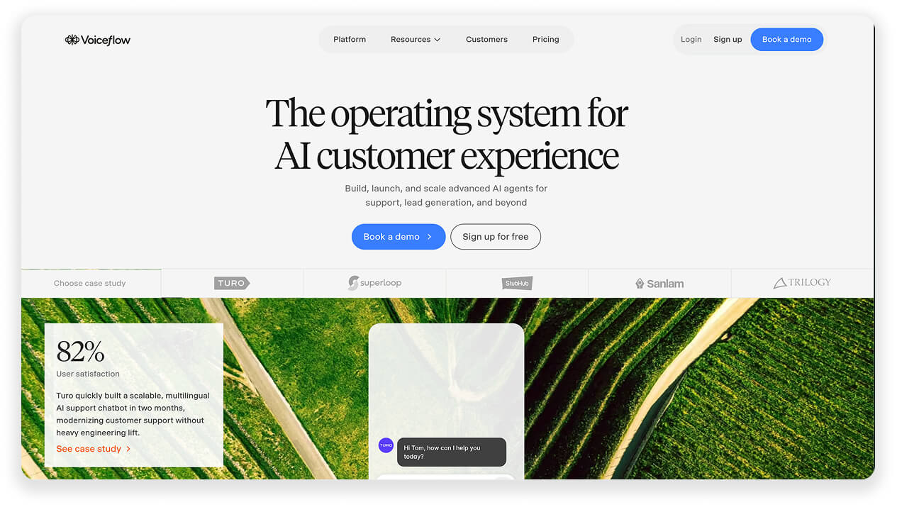
Direction one: serifs. VoiceFlow goes full editorial, a headline set like a magazine cover. It is paired with a simple sans font in Headline 2.
Direction two: keep your sans font, but drop the weight.
The thin sans is the safe update that you can test without messing too much with your CVI.
Ada’s headline uses a thin sans font which creates a more premium feel.
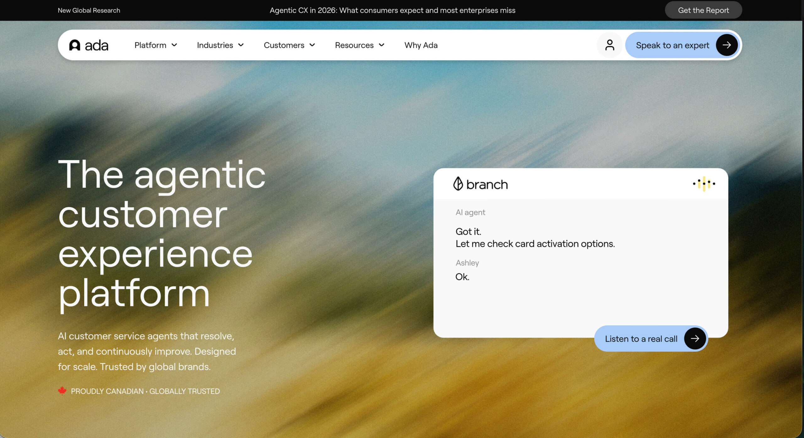
How to implement this on your own website:
Switch your Headline 1 and Headline 2 fonts. If you use a WebFlow or WordPress template, you can easily change your system fonts.
Five free and classy serif fonts to test:
- Instrument Serif: the current AI-brand favourite
- Fraunces: a quirky old-style serif font
- Newsreader: designed for digital editorial, Conde Nast and New Yorker style
- DM Serif Display: glossy fashion magazine vibes
- EB Garamond: more classic literary publisher font
Unique paid serif fonts: Tiempos Headline (Klim), Canela (Commercial Type), Reckless (Displaay), Editorial New (Pangram Pangram), Ogg (Sharp Type)
Digimon break
4. Show don’t tell » Give don’t show
Examples: Replit, Lovable
“Show, don’t tell” used to be the golden rule of header design: feature a product screenshot and let it speak for you.
The leading AI brands turned the tables. They no longer show but let you test the product before signup.
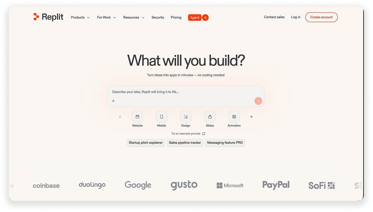
The header no longer displays the product. It contains it. You can type right into the prompt box, see a quick result, and be transferred into the signup flow.
Replit asks “What will you build?” and hands you a prompt box to answer in.
Lovable goes further and skips the button entirely. The prompt box is the CTA.
Remember what I found in the website header copywriting analysis (previous Marketing Fix newsletter): about 90% of your visitors come to website with the conversion decision already made elsewhere.
So your hero’s job isn’t to persuade, but to remove the last step between the visitor and the product.
How to implement this on your own website:
Productise a key feature of your product that visitors can use without signing up. Put it in the hero.
A prompt box, a calculator, a question with 2-3 answer options.
There’s just one condition: the first interaction must deliver value in seconds. A slow or disappointing demo is worse than a CTA button.
5. Imagery » None or all in
Examples: Sierra, Cofounder, Mistral
I’d love to make the Patamon-Angemon comparison here. But it wouldn’t be quite valid.
Angemon certainly exemplifies the all-bells-and-whistles version of a header illustration. But there’s no room for a Patamon: the modest middle ground is gone. It’s either Angemon or empty background.
Hero imagery in 2026 comes in exactly two flavours: none at all, or art-directed by skilled designers.
Zero of the 15 analysed brands use stock photos. Not a single corporate princess smiling into the camera.
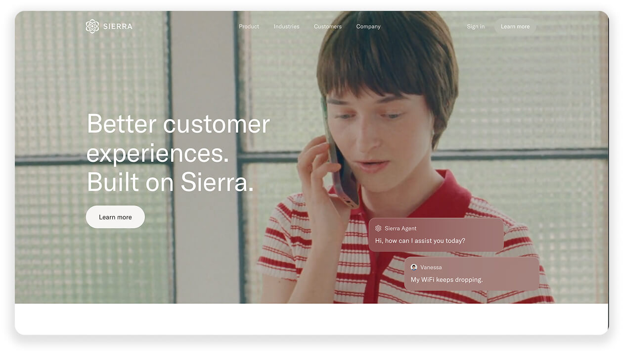
Sierra runs a muted film-still of a real person on the phone. It looks like an Antonioni frame, not a landing page.
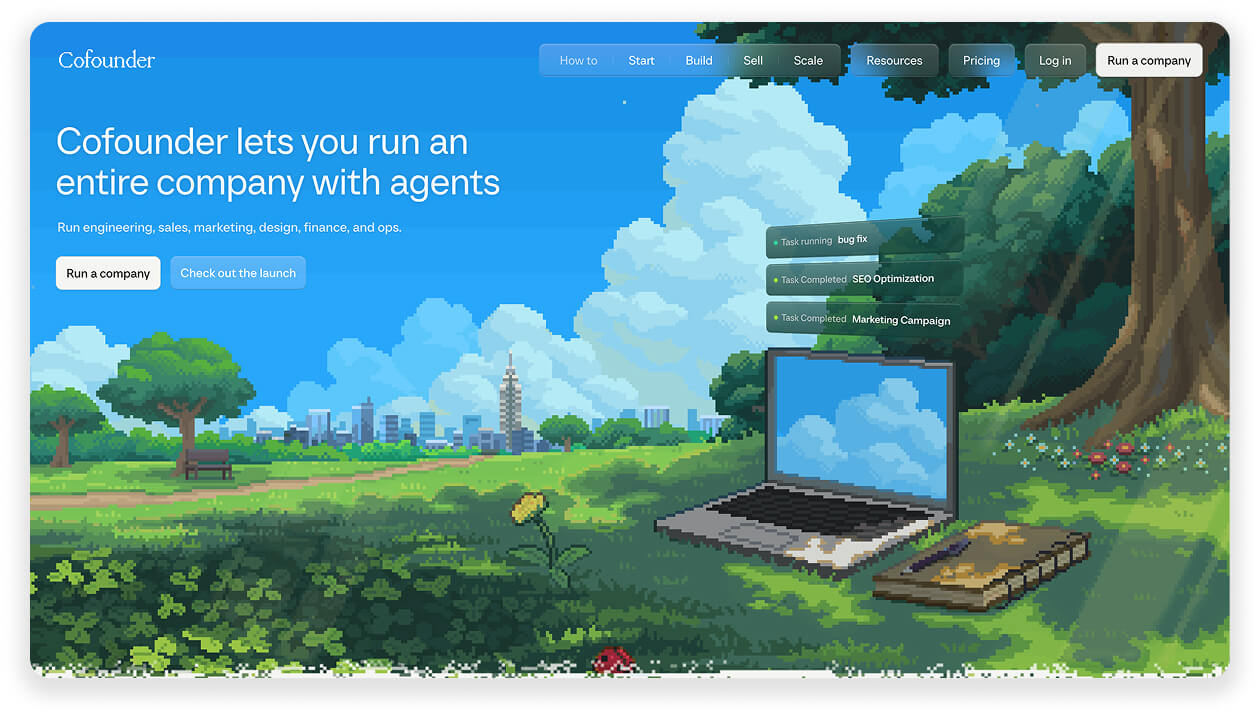
Cofounder commissioned a pixel-art landscape, a laptop resting in a storybook forest. Their entire branding is very difficult and expensive to copy.
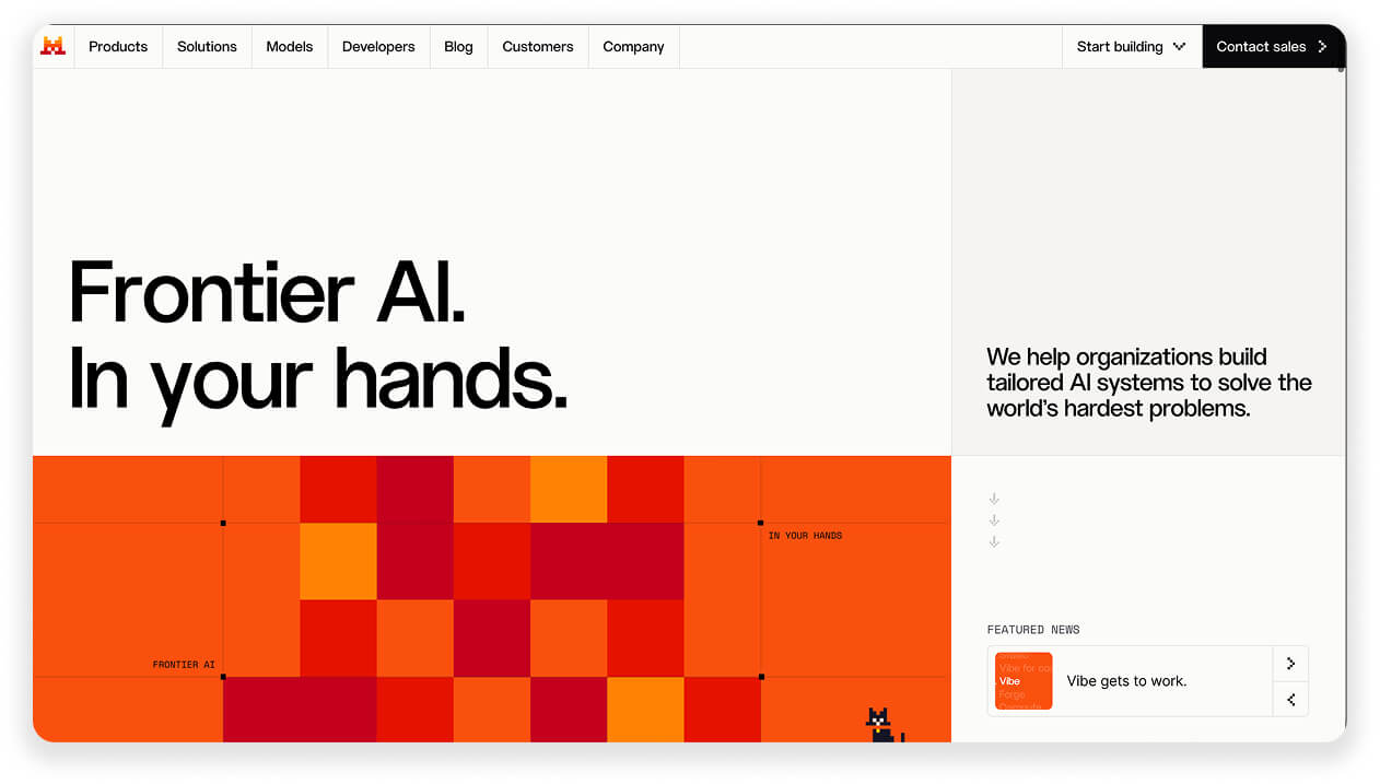
Mistral went the opposite way: no imagery at all, just massive type and a brutalist pixel pattern.
How to implement this on your own website:
Run the swap test on your hero image: if it could appear on a competitor’s site without anyone noticing, change it.
Two directions to explore:
- All in: real photography with actual art direction, or illustration with an artist’s fingerprint. Commission it instead of licencing.
- None: bold typography on a bare background. Free, and yet stronger than a generic illustration.
6. Social proof » The sacred logo bar
Examples: Replit, Notion, Clay, Intercom
A lot above the fold has rotated over the past decade. Layouts, colours, fonts, CTAs…
One element didn’t move: the logo bar.
However, it is worth noting that the logo bar is a quintessential B2B move. A B2B buyer needs to justify the purchase to their boss. A consumer only needs to justify it to themselves.
In B2C, brands showcase the number of active users or trust site ratings.
Out of the analysed brands, Clay and Intercom do it the best.
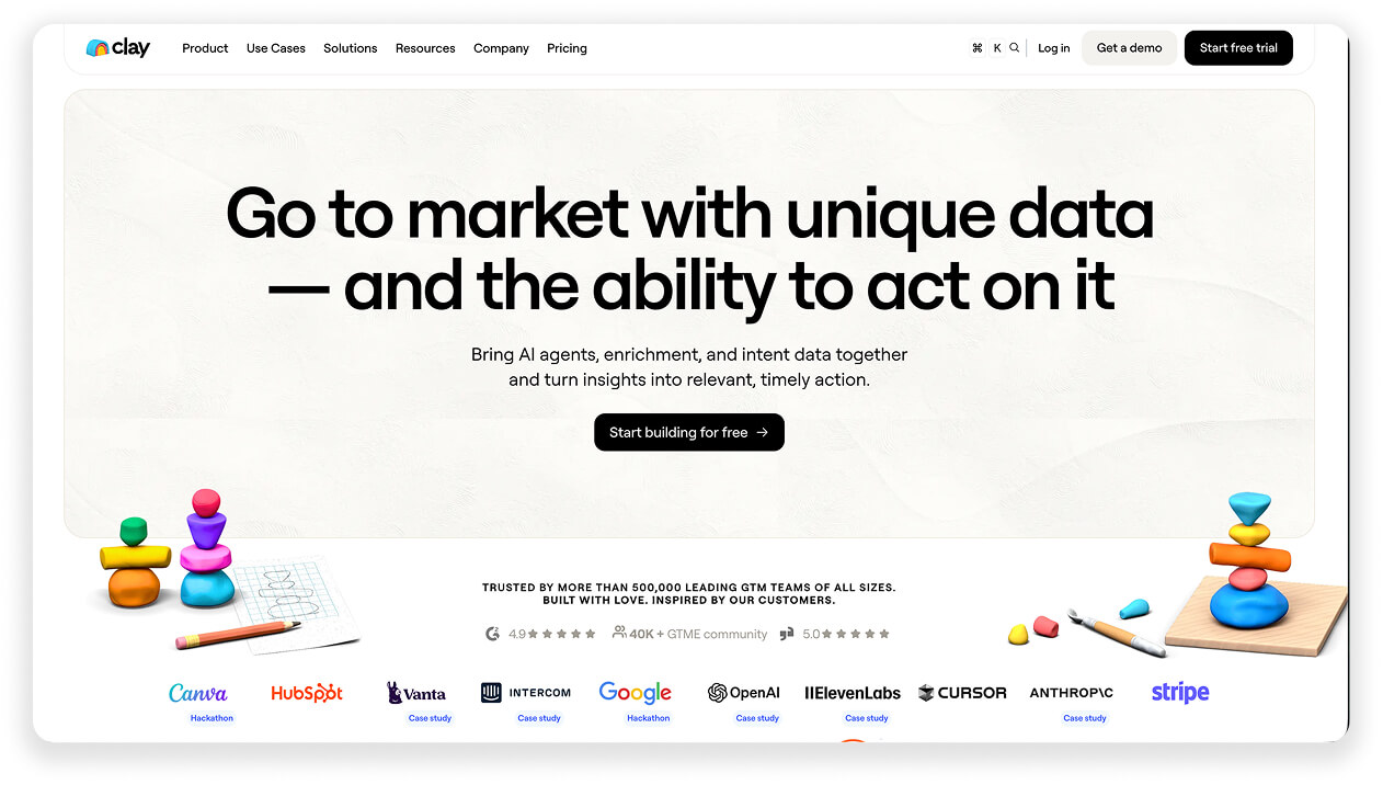
Clay stacks the densest bar of the set under a “trusted by 350,000+ GTM teams” line. And note the little “Case Study” banners next to each!
Intercom takes the logo bar to its extreme. Or shall we say “the logo block?”
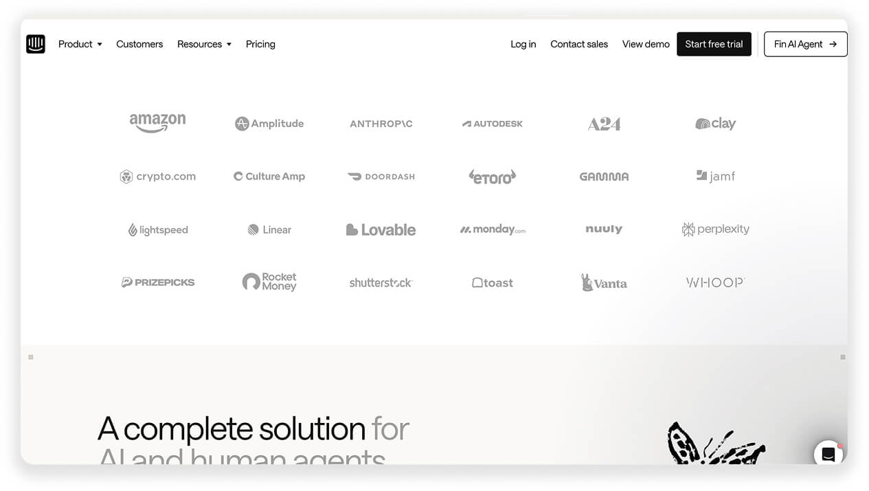
While not in the header, there’s an entire section of nothing but customer logos right under it on Intercom’s website. Twenty-four of them, Amazon to Anthropic to A24, arranged like a wall of honour.
How to implement this on your own website:
Selling to B2B teams? Keep the logo bar inside or directly under the hero.
- Use a mix of universally recognisable logos + trendy industry darlings
- Six no-name logos are worse than none. If your logos aren’t recognisable, skip them.
- Once your customer list gets long enough, do what Intercom does: give it its own section.
Bonus
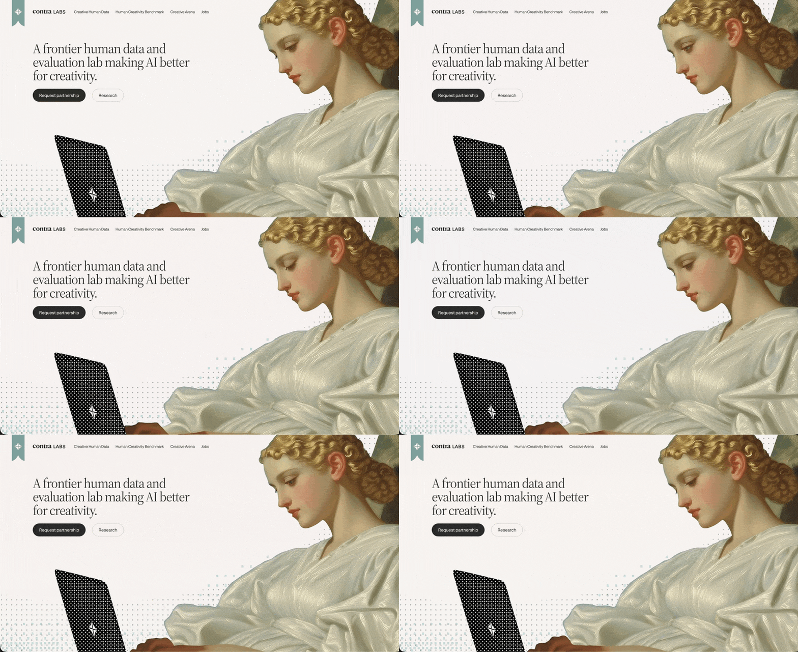
The coolest website I saw when researching this article: Contra Labs
Need help with marketing? I am open for 2-3 new projects starting in September 2026. Read about collaboration options here.
Further reading recommendations: