How to find good Facebook ad examples, both video and static ads?
The best tool for seeing other brands’ Meta ad creatives is the Meta Ad Library.
If you’re looking for a curated list of high-conversion ad examples from top brands, check out all the articles below.
- 215+ Best Facebook Ad Examples (2025 Update) – this guide
- 35 Best Facebook Video Ad Examples
- 80+ TOP Instagram Ad Examples
- 40 Instagram Story Ad Examples
- 100+ LinkedIn Ad Examples
When working on B2B and B2C brands’ Facebook ad campaigns, I always check what their competitors are doing. For more than 8 years, I’ve taken screenshots whenever I see an inspiring example.
In this list of 215+ ads, you’ll find my favourite brands’ advertisements, along with an inside scoop on the latest trends and best practices of Facebook ads.
Facebook ad best practices
What makes a great ad creative?
Based on 10+ years of experience here are my TOP 10 suggestions for successful Facebook ad copywriting and design:
- Communicate a strong value proposition
- Use high-quality images and videos
- Test bright colours and high contrast
- Add a clear call-to-action in the ad visual
- Get started with single-image static ads
- Add other formats like Carousel and video ads
- Write value-driven ad copy and headlines
- Follow correct Facebook ad size
- Include special offers and promotions
- Show proof like testimonials and ratings
Keep reading to learn more Meta ad best practices, followed by specific ad examples.
2025 Facebook ad examples
Ads that worked in 2020 may not deliver high ROI (return on investment) in 2025. To improve your results, you must be constantly experimenting with new ideas, perhaps even use AI for ad generation.
See inspiring Facebook ad creatives from brands across 10 industries:
- B2C (business to consumer) beauty products
- B2C food & grocery products
- Consumer apps & subscriptions
- B2C technology products
- B2C household products
- DTC (direct to consumer) consumer products
- B2B (business to business) software brands
- B2B service providers
- B2B enterprise-level products
- Magazines and newsletters
Boots

Best practices in this ad:
- Create special ads for holidays and occasions like Mother’s Day
- Include your logo in the ad creative
- Use bright contrast and colours
- Showcase multiple products in a carousel ad
- Use the “Shop Now” call to action to drive sales
KFC

Best practices in this ad:
- Promote special offers with limited time to create a sense of urgency
- Use super high-quality photography, enhanced with image editing tools
- Mention the product price in the ad if it’s impressively cheap
Revolut

What’s great about this ad:
- Promote an unique offer, in this case a customised bank card
- Edit static ads into videos: slight movement helps to capture attention
- Include App Store icons throughout the ad, indicating you’re promoting a mobile app
Sensodyne

What’s great about this ad:
- Include social proof, e.g. “No.1 dentist recommended brand”
- Make your product stand out in the visual for higher brand recognition
- Keep it simple and light: Meta ads with white background tend to perform better
Uber Eats

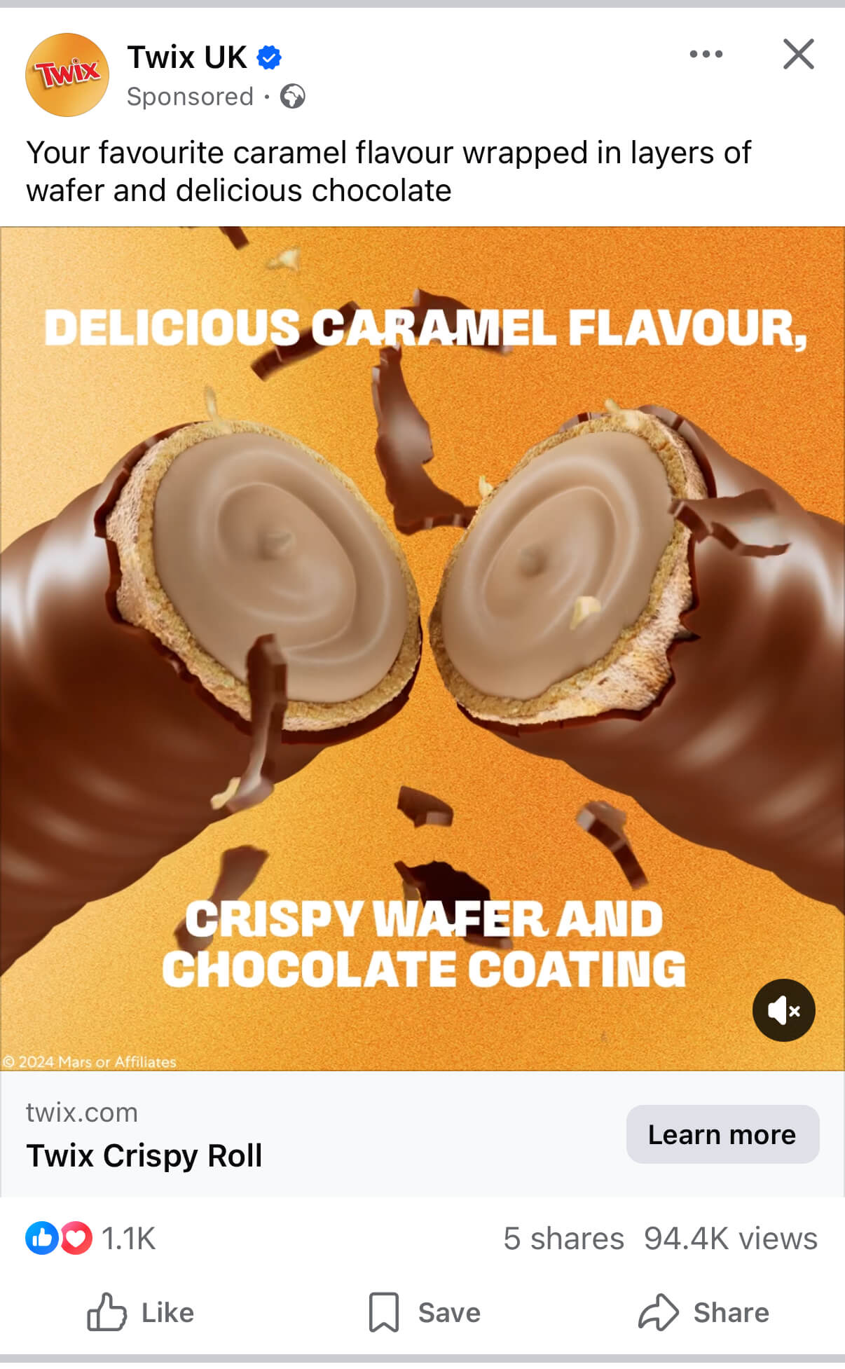
Twix
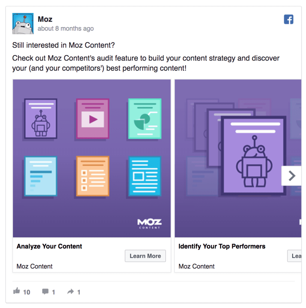
H&M

Pantene

Lidl

Fairy

Garnier

Doritos

McDonald’s

Access free LinkedIn ad examples gallery, 2025
Charlotte Tilbury

Clarins

Mercedes Benz

Maltesers

Ninja Kitchen

Lofbergs

Maryland Cookies

Harry Potter

Transport for London

M&M’s

YSL Beauty

The Joy of Plants

Walkers

TK Maxx

Toblerone

Vinted

2024 Meta ad examples
The Meta ad examples in this section were collected in late 2024.
- SaaS & B2B Meta ad examples
- B2C digital product ad creatives
- Consumer product Facebook ads
- E-commerce & fashion ads
All of the Meta ad examples that you see here are original screenshots from my Facebook feed or from the Facebook advertising audits I’ve done, and Facebook Ads Library. The Facebook ads’ size is usually 1080 x 1080 pixels for square creatives and 1920 x 1080 for the Story format.
Access free LinkedIn ad examples gallery, 2025
#1 Heinz

#2 Blinkist

What’s great about this ad:
- The ad has a meme-like style that feels native in Facebook and Instagram
- The creative exemplifies the benefits of the product in a fun, engaging way
- The ad copy is straight to the point, and mentions a clear value prop
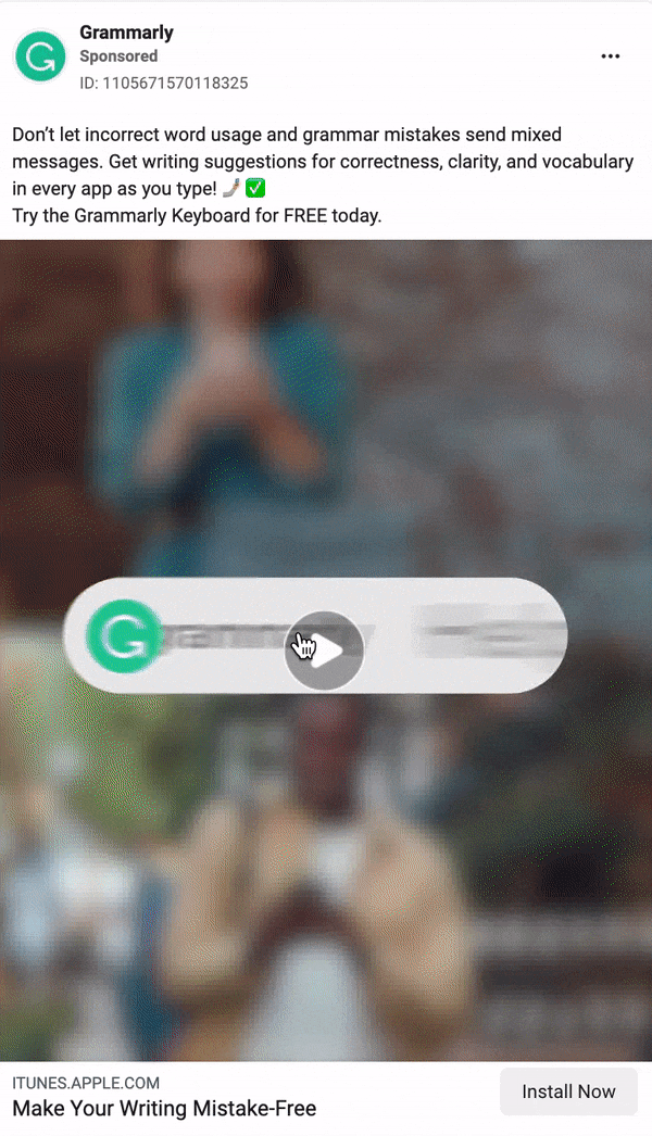
#3 Grammarly

What’s great about this ad:
- The visual includes the logo, clear USP, and CTA button
- The double-choice question in the ad invites the viewer to click and find out more
- Static ads tend to outperform video ads in square formats
#4-5 Vinted


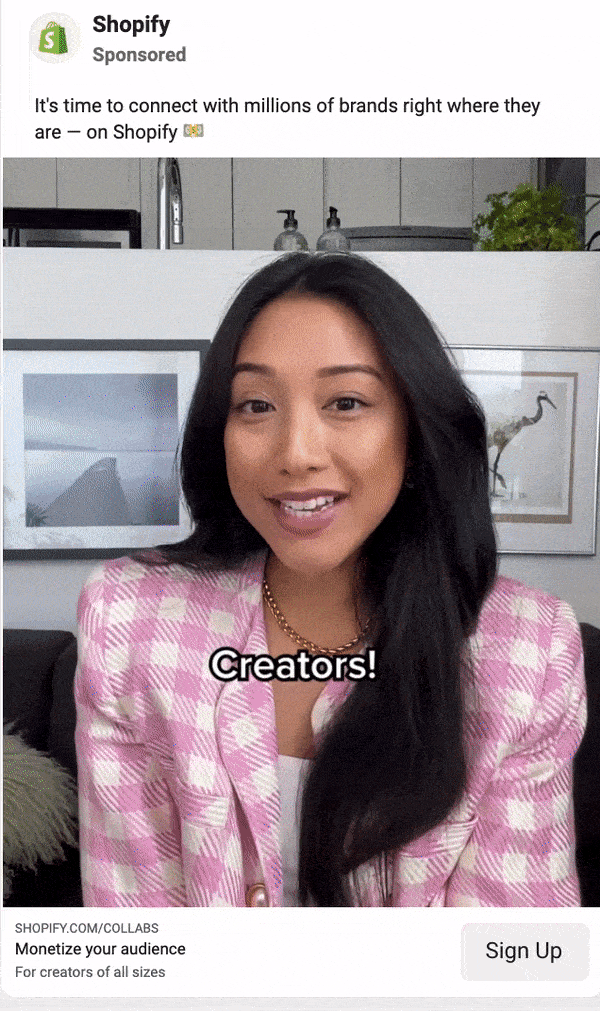
#6 Shopify

#7 Wise

#8 Bilance

#9 Oreo

#10 IKEA

#11 McDonald’s

#12 Alohas

#13 Kerastase

#14 Ferm Living

#15 L:a Bruket

💫 2023 update! 💫
Doing the roundup of the latest top Facebook ad examples is one of my favorite tasks in January.
When researching this year’s winner, I went through 50+ brands’ Facebook Ad Library pages.
Here are the 3 key trends that I noticed in 2023 Facebook ad creatives:
- Brands are sooo slow to update their creatives – many brands run the exact same ads as in 2022. While these creatives may have performed really well, testing a new creative idea biweekly would certainly yield even better results.
- There are even more portrait-story format ads – some B2C brands have nearly given up on the Feed ad placements and bet big on Stories and Reels. Naturally, all portrait-format ads should be videos.
- The UGC video ad trend – While promoting UGC (user-generated videos) is the #1 strategy on TikTok, it’s been only slowly adopted by Meta advertisers. In 2023, more brands will be collaborating with content creators to produce their video ads.
But hey, let’s cut the talk and let these smart Meta ads speak for themselves.
#1 Shopify
I chose this social media ad example by Spotify to open the roundup as it’s the epitome of the perfect ad creative in 2023.
It’s a video ad, it’s fast-paced and engaging, it features user-generated content, and it’s also showcasing the product later in the video.
#2 Grammarly
Grammarly is one of the brands I’ve been always following for the best video ad examples. In this simple video ad, they both tell an engaging story and illustrate how their product helps to improve the users’ everyday lives.
Tip: Keep in mind that having the best ad creatives is just one piece of the puzzle. In addition to having the best ad creatives, make sure to also get your Facebook ad campaign structure right.
#3 IKEA
It feels like the advertisements are getting more colourful and fast all across the board. Ikea’s taken the opposite approach. In the overloaded Facebook and Instagram feeds, this Ikea carousel ad example will feel like a breadth of fresh air.
This ad creative is also the perfect proof that you don’t need a huge design team and fancy 3D animations to create a well-performing ad. A bit of creativity will do.

#4 Burger King
Ufff, such a boring ad example from Burger King, the master of creative advertising!
But the point is… Even brands with huge offline and online brand campaigns are using Meta to boost user acquisition. The trick of adding numbers – low prices, discount %, etc. – is not going anywhere in 2023.
As I already wrote in my Facebook Ad Design Hacks, showing some numbers in ad creatives always helps to get better campaign performance.

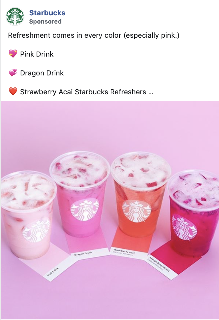
#5 Starbucks
A “winning ad examples compilation” isn’t complete with a creative by Starbucks. I keep returning to this brand’s Ad Library page to gather inspiration. If there’s one advertiser that keeps continuously reinventing its ad visuals, it’s SB!
I chose this particular ad as I liked how it it combines the promotion of five different products in an single image. An idea to test in 2023! 😉

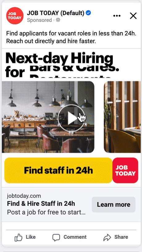
#6 Job Today
Time for some client appreciation! In 2022 and 2023, I’ve been helping Job Today with their growth marketing strategy and Facebook ads.
Together with their Brand team, we created a collection of 50+ different ad creatives in just two months. I find the video ad below to be a good example of how static ads can be turned into videos with reasonable effort and time.
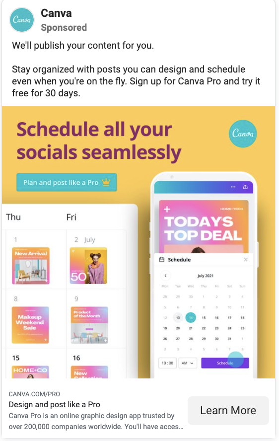
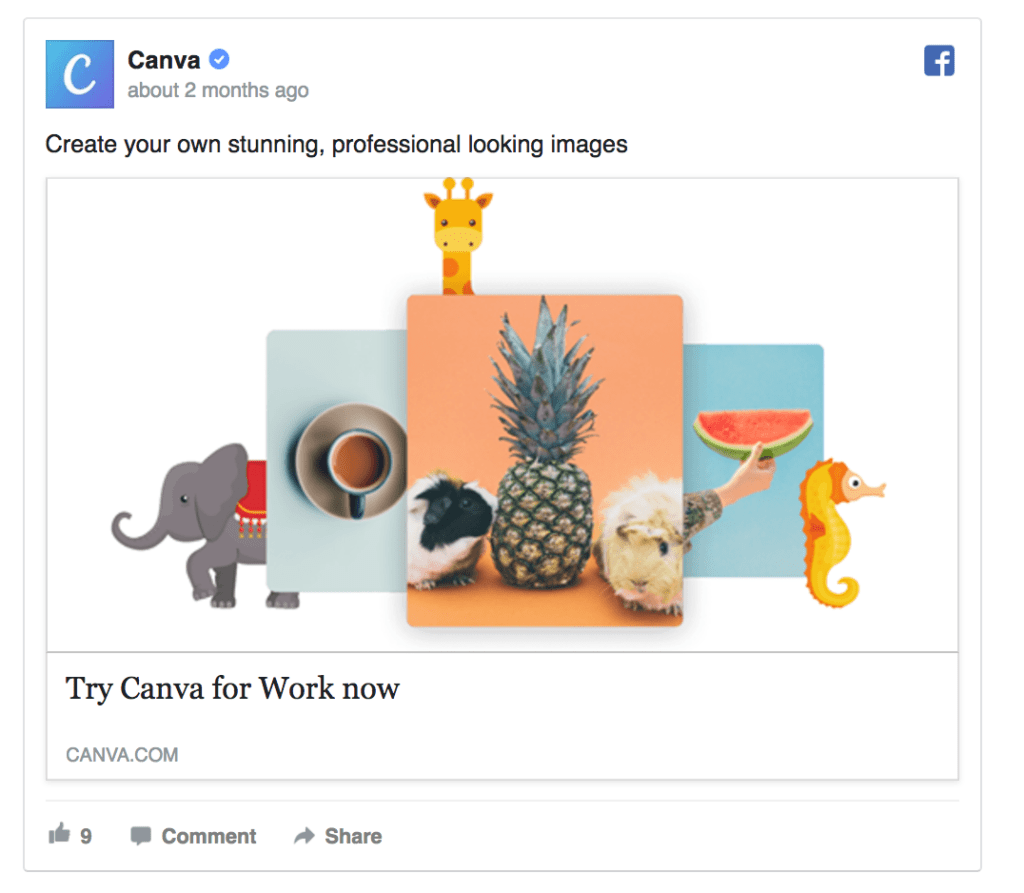
#7 Canva
Testimonial ads aren’t going anywhere in 2023. There will only be more ways to visualize your user feedback: static ads like Canva’s, videos of user interviews, customer case studies, success stories, etc.
Testimonial and case study ads work well both in Prospecting and Remarketing stages, but you may want to create slightly different ad texts and CTAs for either option.

#8 Qminder
Client example vol 2! Here’s a social advertisement example that we created together with Qminder, designed by yours truly. The ad text is simple and mentioning 2023 on the first week of the year makes the offer feel 110% timely. We also mentioned the main benefits and features of the product to explain how Qminder can help companies improve their visitor experience.
( + I sometimes feel that my job title is Graphic Designer rather than Growth Marketer.)

#9 ClickUp
Recently, ClickUp has become one of the main advertisers whose Ad Library page I check for B2B Facebook ad inspiration. From memes to high-quality testimonial videos, they’ve got all the best practices covered.
This particular example serves as a reminder to promote special offers and discounts and make this the focal point of your ad visual. So simple, so efficient.

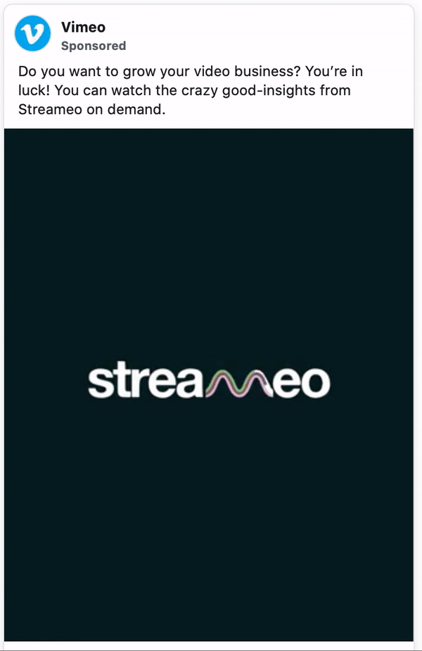
#10 Vimeo
When creating video ads for Meta, remember to show your brand in the first 3 seconds and then keep the viewers hooked with fast movement. Check out other Vimeo ads for more examples of fast-paced, informative video ads that introduce the product and features.
That’s it, folks. I could make this article another 50 examples long but in the end, it’s all about what works for your brand. My recommendation for achieving success with your Meta ads in 2023 is to put more effort and time into creating top-notch visuals.
Browse the Ad Library (and this article) for endless inspiration.
💎 2022 update! 💎
Every year, I see an increasing number of brands using video-format ads. Another trend I’ve noticed is that brand awareness-style ads (featuring filmed video content similar to YouTube and TV ads) are en vogue. However, I still believe that Facebook ads that showcase numbers, products, and promotions will bring you the best ROI.
The following 10 Facebook ad examples feature the best static ad creatives from some of the world’s leading brands. Hope you’ll find some inspiration for revamping your own ad creatives!
If you’re working on eCommerce ads, see more examples here: eCommerce Ads Guide & 20 Ad Examples.
#1 AirHelp
There’s no more timely Meta ad example to begin the 2022 showcase with than one advertising help with flight delays. :p
AirHelp’s ad hits right on the nerve: it asks a question that relevant audiences will identify with and offers a solution. Bonus points for mentioning the possible compensation amount.

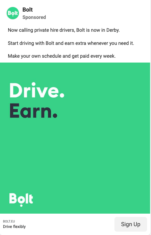
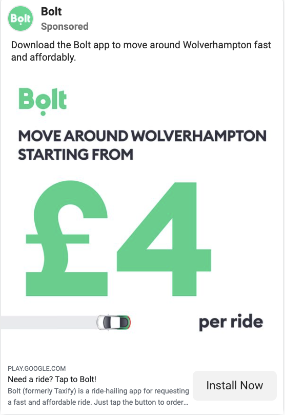
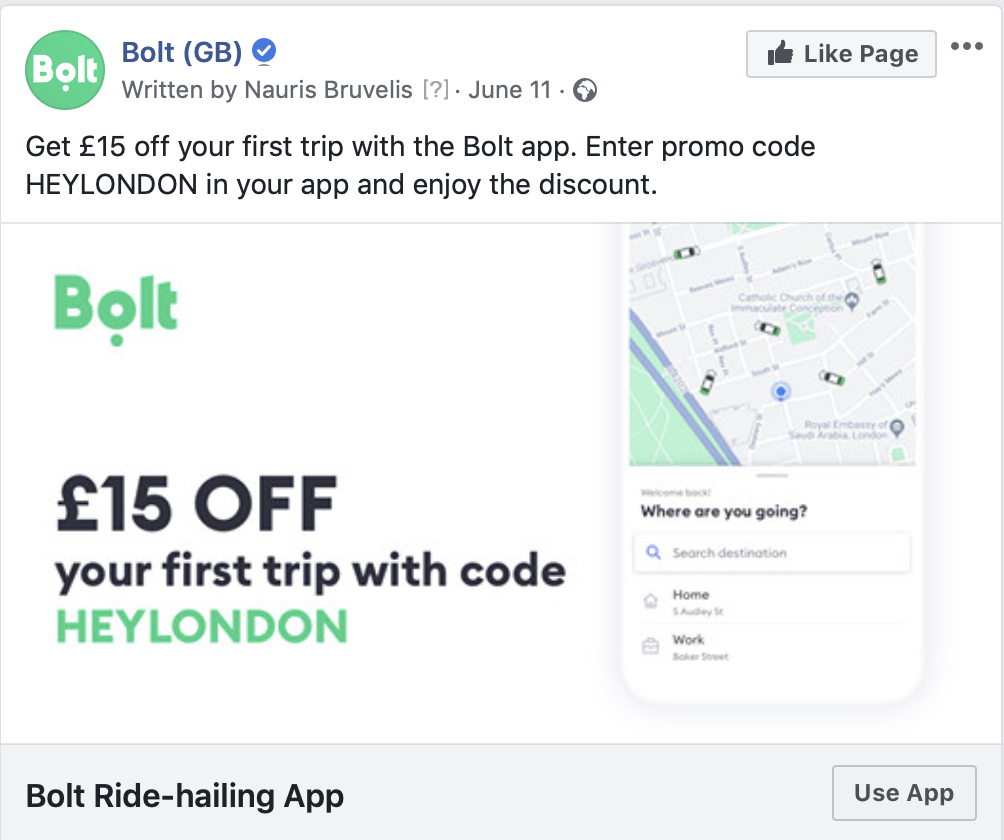
#2 Bolt
It was encouraging to see that since I left Bolt, there haven’t been many changes to the top-performing ad creatives. We kept the design minimal and catchy and it worked like a charm.
When adding new ad creatives to your campaigns, always leave on some high-performers. Why kill something that’s working?
#3 Starbucks
Starbucks’s ad is a great example of a simple static ad turned into a video. The only things animated in the visual are various coffee packs. You don’t need a huge budget to create video ads, just be creative.

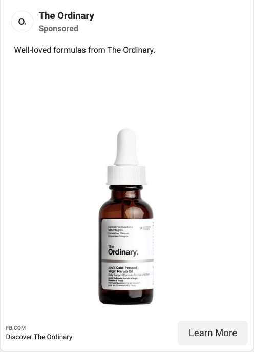
#4 The Ordinary
Think that simply featuring your product on a white background looks boring? Possibly. But it works – the focus is just in the right element. Moreover, this ad will be highly visible in the image-heavy Facebook and Instagram feeds.
#5 Oreo
I’ve always returned to Oreo’s ads for inspiration – they’re always on-brand and the team keeps coming up with new cool ways to make people engage with their product.

#6 Greenpeace
It’s hard to convince people to choose the ethical option. This Facebook ad by Greenpeace uses a soft shock tactic to raise awareness. Also, featuring media coverage of your product and brand is a smart way to add credibility to your message and mission.

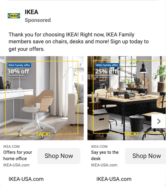
#7 IKEA
Carousel ads are still a thing in 2022. Take this example by Ikea. I also like how they’ve managed to “brand” the regular-looking photos with a yellow line + in-image text. I bet this works much better than just a photo.
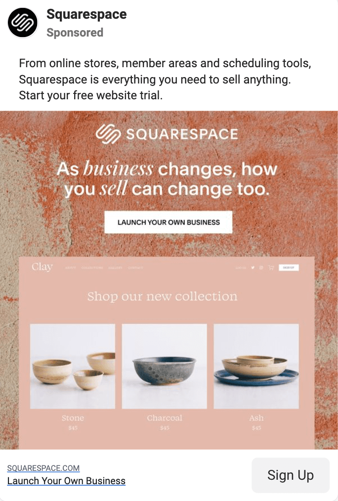
#8 Squarespace
Here’s one for the SaaS businesses. Instead of showing just a boring product interface, Squarespace shows the result of using their product. Also, using a textured background for a more interesting end result is a nice idea to test in 2022.
#9 The New York Times
This ad serves as a good reminder that Facebook removed its 20% text limit already a couple of years ago. Using text-heavy ads with bright colors is an interesting way to catch people’s attention.

#10 La Roche-Posay
We’ll end the 2022 showcase with another ad from the beauty industry. Similarly to the afore-mentioned ad by The Ordinary, this Facebook creative features a single product on a white backdrop. Only they’ve added a promo offer and some text. Test with both options.

💎 2021 update! 💎
This year, when browsing the Facebook Ad Library for the best new static Facebook ad creatives, I noticed several trends: bold use of color and text as well as a more creative and fun approach to visual communication.
Here are the top 5 trends in Facebook ad creatives in 2021:
- All top brands use a mix of video and static ad creatives.
- Advertisers create all their ads in two formats: for the feed and story placements.
- There’s been a shift towards more colorful ads, introducing more flexibility in regards to the brand CVI.
- Many brands use automation tools to customize ads for specific locations or product groups.
- After Facebook removed the 20% text limit, more brands opt for big bold typography with text covering up to 90% of the visual.
#1 Gorillas
In 2021, the grocery delivery ups sprung up like mushrooms after rain. They all advertise pretty much the same message: Get your groceries delivered in 10 (or 15) minutes.
This ad example by Gorillas is exemplative of several design trends: eye-catching colors, bold typography, and a locally customized messaging.

#2 Nike
Compared to boring product photos on white background (which Nike is also heavily advertising), this creative will attract much more attention in the Facebook feed full of photos and news articles.
If you’re creating ads for an eCommerce brand, test showcasing your products on a colorful backdrop instead of a plain white background.

#3 Canva
This Facebook ad by Canva manages to include two product screenshots AND a headline AND a CTA button. Props to their designers.
#4 Spotify
Spotify has been using colorful illustrations in their ad visuals for years, so they’re rather leading a trend than following it. In 2021, more brands have connected with designers to create custom illustrations to be used in social media and ad visuals.
As a fan of beautiful illustratorial work, I consider such ads to have a positive effect on the long-term brand perception, even if they may not perform as well CPA-wise as more plain and straightforward creatives.

#5 Restream
Restream’s ad comprises several visual trends: 3D illustrations, gradient color schemes, and bold typography. Moreover, the ad copy is short and straightworward, highlighting the top features and benefits of the product.
Discloser: I am currently working with Restream on their Facebook ad creatives and campaign management.

#6 Bolt
The advertising team in Bolt is one of the most performance-oriented that I’ve encountered, so checking their ads is a good way to uncover the latest Facebook advertising hacks and trends.
Bold typography, emphasizing relevant numbers, and customizing the ad to the location that they’re targeting help to attract the viewer’s attention as well as make them click and download the app to get the deal.
#7 Klarna
If you want your Facebook ad to feature a photo, try applying it inside a geometrical shape and adding some colorful background. Much more visible and efficient than a basic picture.

#8 Starbucks
Similar to the Nike ad above, Starbucks is placing their products on backdrops bursting with color. That’s been a strategy used by the coffee brand for several years already, so something about it must work.

#9 Squarespace
This text-only ad by Squarespace inspired me to test a similar aesthetic approach with several of my clients. In most cases, ads with heavy text performed surprisingly well.
Now that Facebook is not disapproving text-heavy ads anymore, it is worth testing a simple ad with colorful background and well-chosen bold fonts. Add some emojis, highlighted words or illustrations to make your ad more interesting.

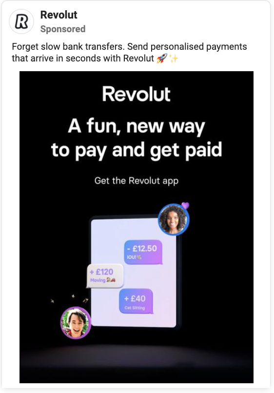
#10 Revolut
Contrary to most advertisers avoiding dark creatives, Revolut’s going against the flow.
However, I’d recommend to first test dark-shaded ads against light and colorful ones and only doubling down on those once you see that they perform well. In my experience, light-backgrounded and colorful ads outperform very dark creatives.
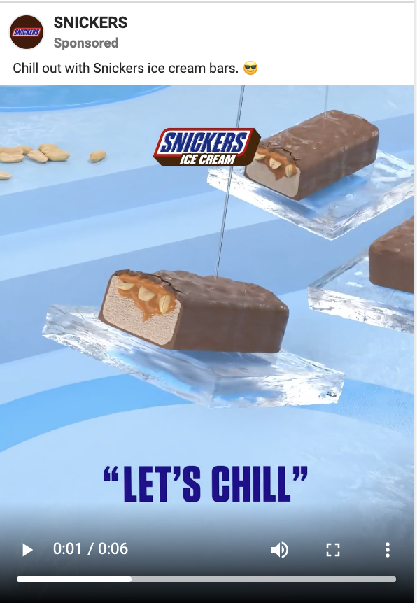
#11 Snickers
If you’re advertising to millennials and even younger audiences, check out what Snickers is doing with their ads. The creativity of their creative agencies seems to be boundless. Or maybe they just ate a Snickers…
#12 Gorillas
Another strong Instagram ad example by Gorillas, this time centering the visual around number 10 – this is how much it’s supposed to take to get your groceries delivered.

#13 VanMoof
There are three things that make this ad rather smart: the use of strangely positioned bike, light colors, and customized location in the in-image headline. As a combination, I’d assume it performs rather well for them.

#14 COS
Sales ads do not have to look cheap. COS has found a way for to get their -50% sales promotion across in a simple and arguably stylish way.

#15 McDonald’s
We’ll end the 2021 ad example showdown with an ad by McDonald’s. First of all, offering to give anything away for free always gets people clicking. But also, the 3D typography and custom illustrations make the ad look much nicer than a photoshopped burger picture would.
Colors, illustrations, bold typography… What a 2021-trendy ad.

🎈2020 update! 🎈
To keep this article from becoming too heavy to load, we added 18 new paid social ad examples from 2020 to another page. Check them out here.
Looking for Instagram ad examples instead? Here are 84 best Instagram ad examples and 40 good examples of Instagram story ads.
As you work through this article, you will:
- Have a better sense of what’s working
- Have many new ideas for improving your Facebook ads
- Feel inspired to set up new types of ad campaigns
How to find Facebook ad examples?
If all these ad creatives showcased in this guide are not enough for you or you want to see more ads from a specific brand, you can easily do it.
In 2019, Facebook released their Ads Library to create additional transparency around the ads any specific Facebook page is promoting.
You can type in any brand name and pick a location to see what ads they’re running.

Truth be told, I’ve tested out the Ads Library on many occasions and seen that only a fraction of all the live ad creatives are visible there (when comparing to the ads I know a brand I’m working with is running or the ads I’ve been shown by specific brand in my Facebook Feed.) But hey, it’s better than nothing!
Also, AdEspresso used to have an Ads Gallery that showed thousands of Facebook ad creatives. As of July 2019, they have closed it down.
Read more: 25+ TOP Marketing Newsletters that I recommend in 2025
NEW 20 Facebook ad examples, 2019 edition
#1: DoorDash

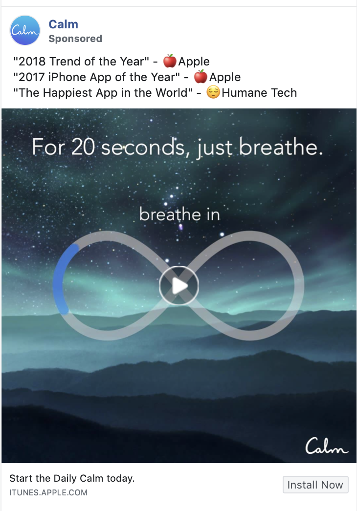
#2: Calm
#3: Oatly

#4: Design Pickle

#5: Bolt
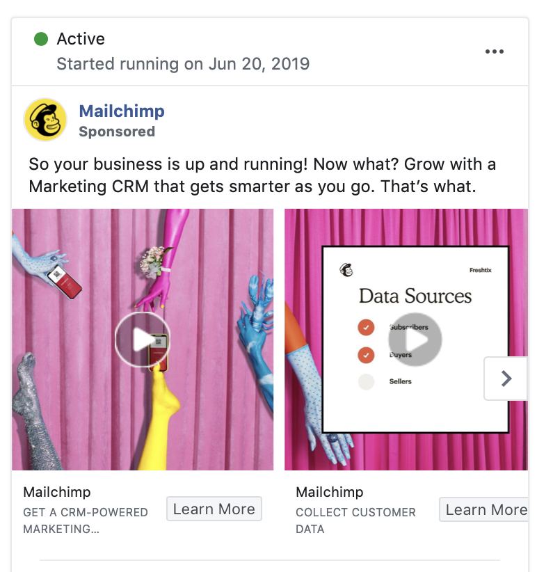
#6: Mailchimp
#7: Finnish Design Shop

#8: Slack

#9: Hired

#10: PayPal

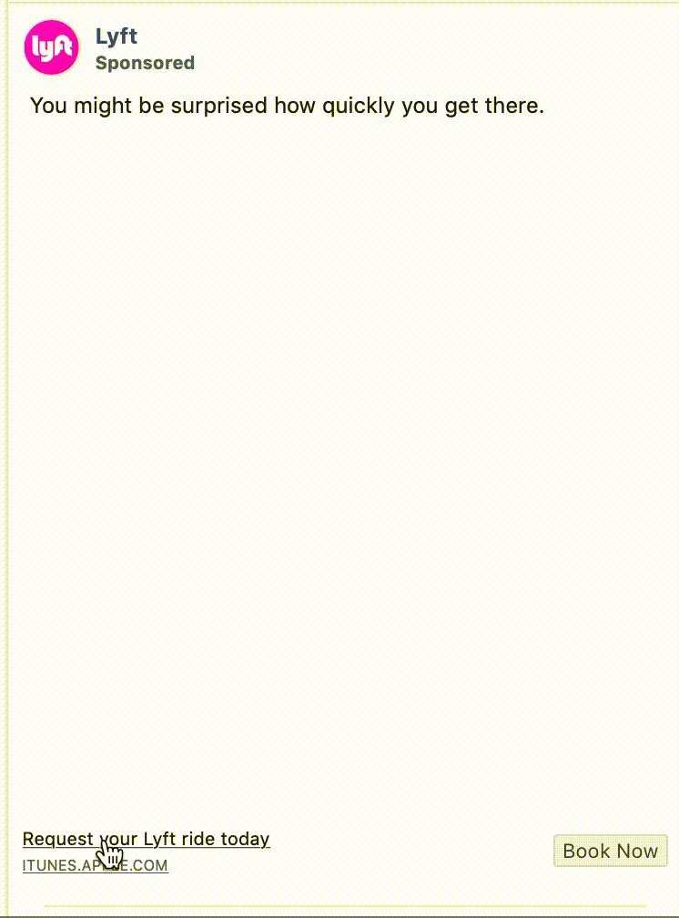
#11: Lyft
#12: Blinkist

#13: Ben & Jerry’s

#14: Holini
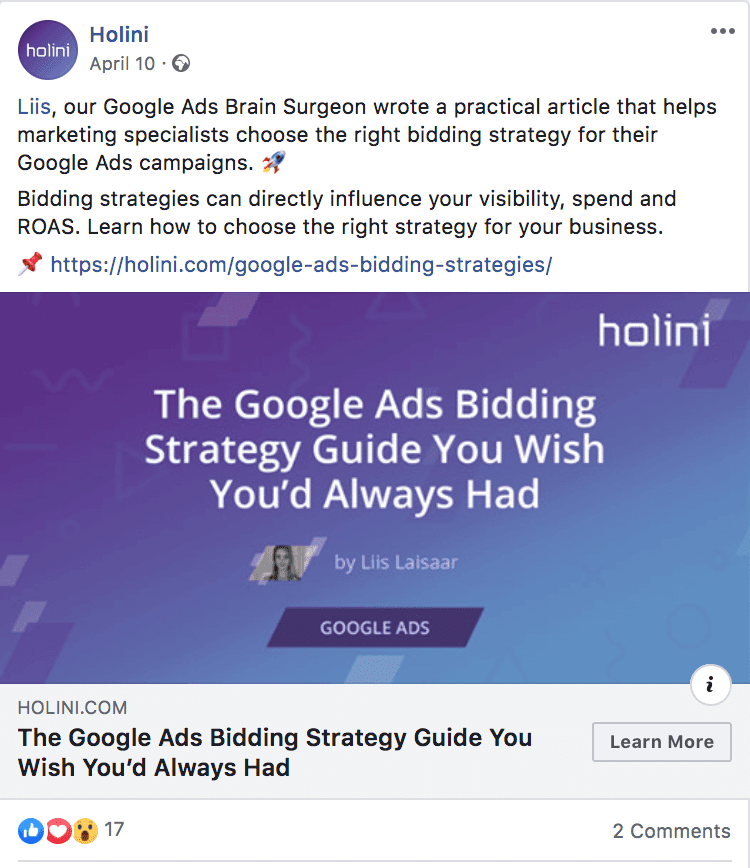
What makes this ad so good:
Did you notice the “? link” in the ad copy? Adding an extra link for people to click on can increase your Facebook ad’s CTR. + Holini’s also smart about their ad design – use a custom colour filter to turn any stock image into a branded image.
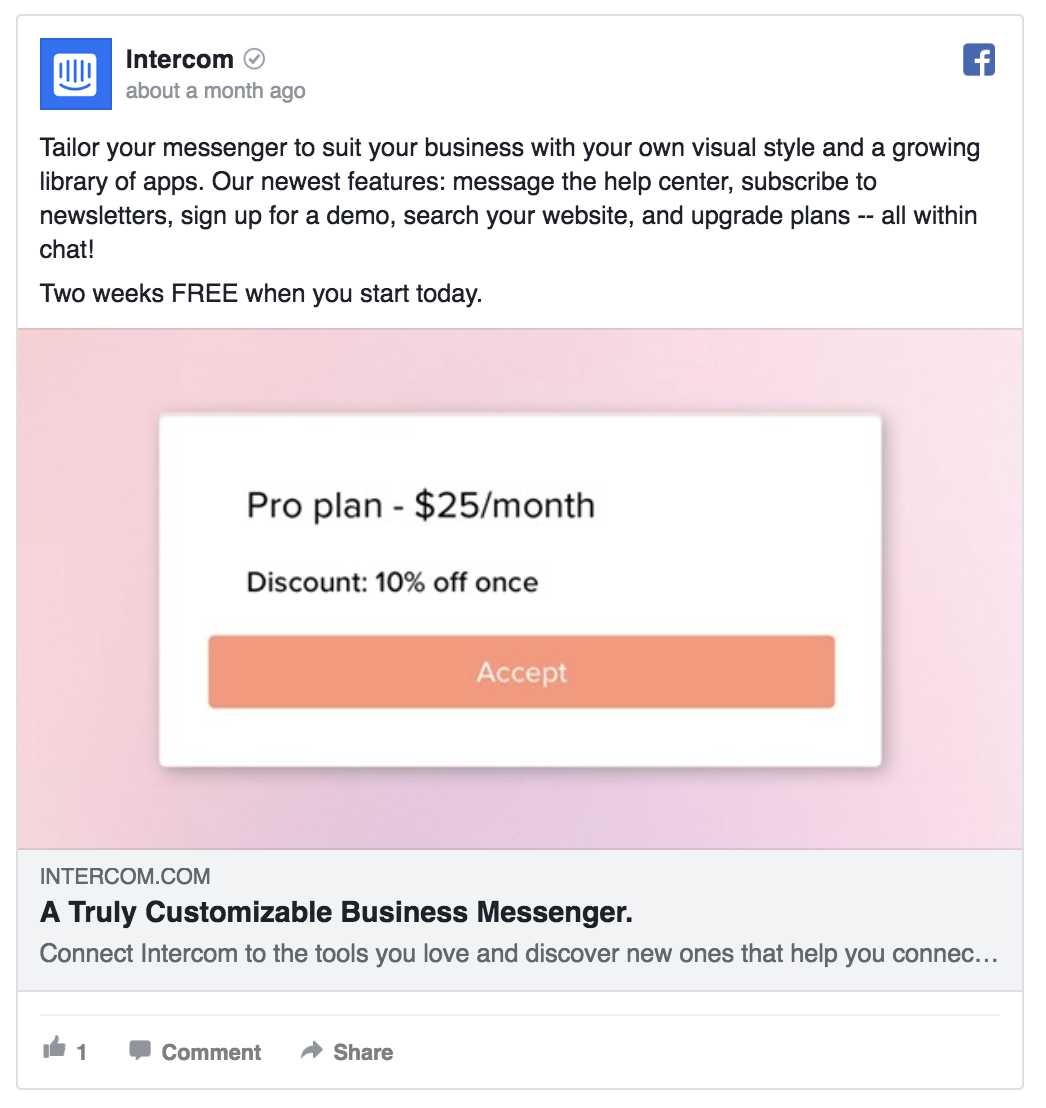
#15: Intercom
#16: Shopify

#17: The New York Times

#18: Asana

#19: Starbucks
#20: Warby Parker

When browsing for new ad examples for the 2019 update, I noticed a few things:
- An increasing number of advertisers are running video ads – of all the brands I checked out in the Facebook Ads Library, 9/10 had video ads running.
- Instagram Stories placement is still strongly underused – while Facebook has told that Stories will soon have more views than regular Instagram posts, only 3/10 advertisers had portrait-format Instagram Stories creatives.
- The best practices haven’t really changed – while there’s a growing trend in colorful and “artsy” ads, the main hacks have remained unchanged: add copy in the ad image, keep it short and catchy, have a clear call-to-action, and so on.
140+ Facebook ad examples, 2018 edition
#1: MOO

What makes this ad so good:
The bright Facebook ad design immediately catches people’s attention + the ad’s headline says clearly what it is they’re selling. When creating Facebook ad images, it’s always a good idea to use an original photo or animation – it’s an easy way to catch people’s attention and show off your branding.
#2: Pipedrive
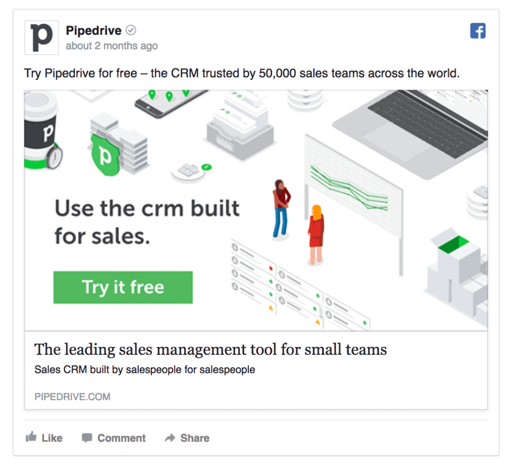
What makes this ad so good:
The in-image copy makes sure the most important copy gets immediately seen + a CTA button hints people can click on the ad. Pipedrive’s SaaS Facebook ad also makes it easy to understand what product they’re selling – it’s made loud and clear in the ad image, main text, headline, and link description. (Look at it as an interesting use of repetitive yet efficient messaging.)
#3: MindTitan

What makes this ad so good:
This ad example uses the carousel format that lets you add up to 10 images into a single ad (the perfect way of showcasing your products / telling a story) + the ad’s design has an eye-catching contrast to it. You can use Facebook carousel ads to tell a story, showcase your products, or list the benefits to customers (as MindTitan’s ad does).
Full disclosure: MindTitan’s one of my clients ATM.
#4: PayPal
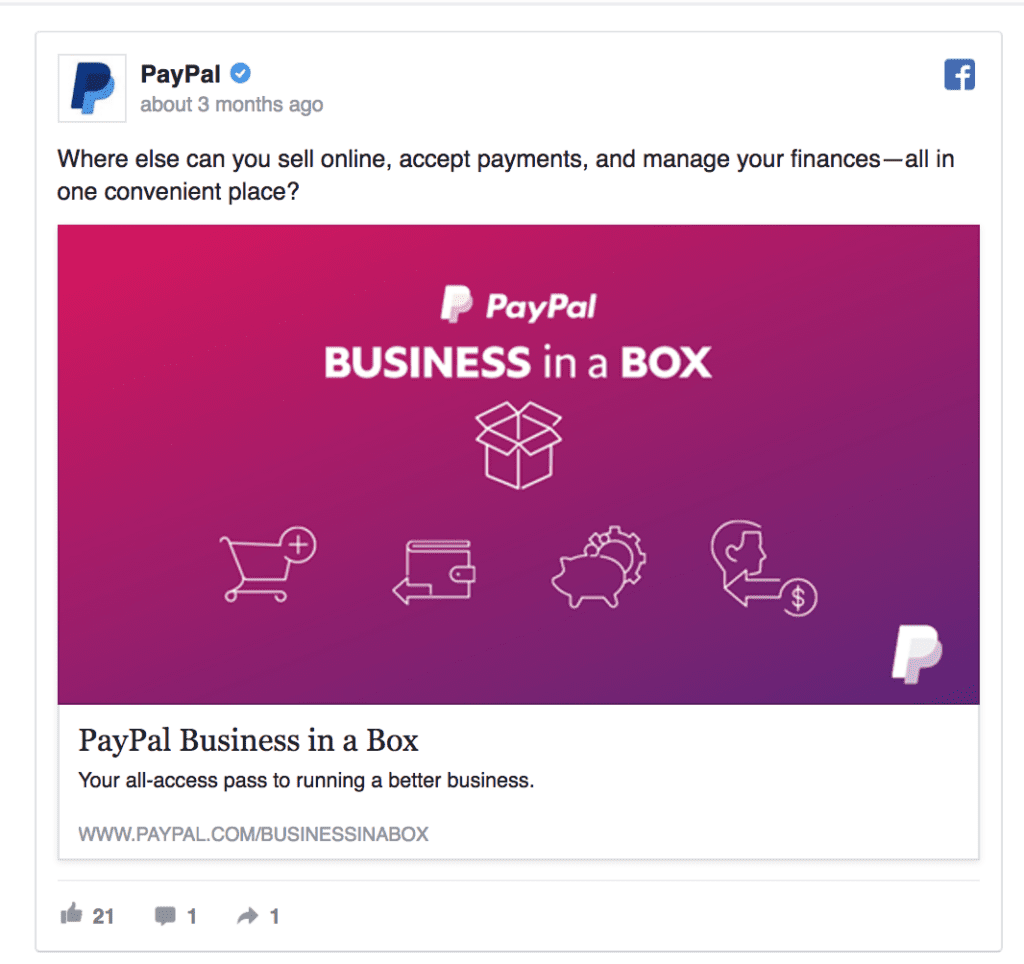
What makes this ad so good:
The icons help to convey the message and make PayPal’s ad a little more engaging, leading to lower Facebook ads cost. A common line between great B2B and B2C Facebook ad examples is their masterful use of colour and minimal design.
#5: Canva
What makes this ad so good:
Canva’s ad is fun and simple at the same time. When you think about your Facebook feed, it’s usually filled with photos. Using a white colourful Facebook ad design helps to get your ad noticed.
#6: Shopify
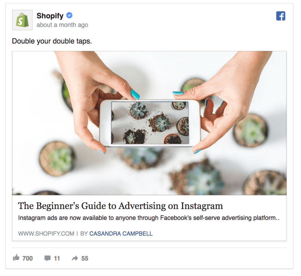
What makes this ad so good:
Not all Facebook ads are focused on sales. This example by Shopify is using Facebook to share their blog content and increase brand awareness.
#7: Autopilot

What makes this ad so good:
Autopilot ad is a great example of SaaS marketing done right. The text lists their product’s benefits while the carousel’s images showcase their product views and features. As a result, this Facebook ad informs the viewer about Autopilot’s product even before they visit the website.
#8: Zendesk
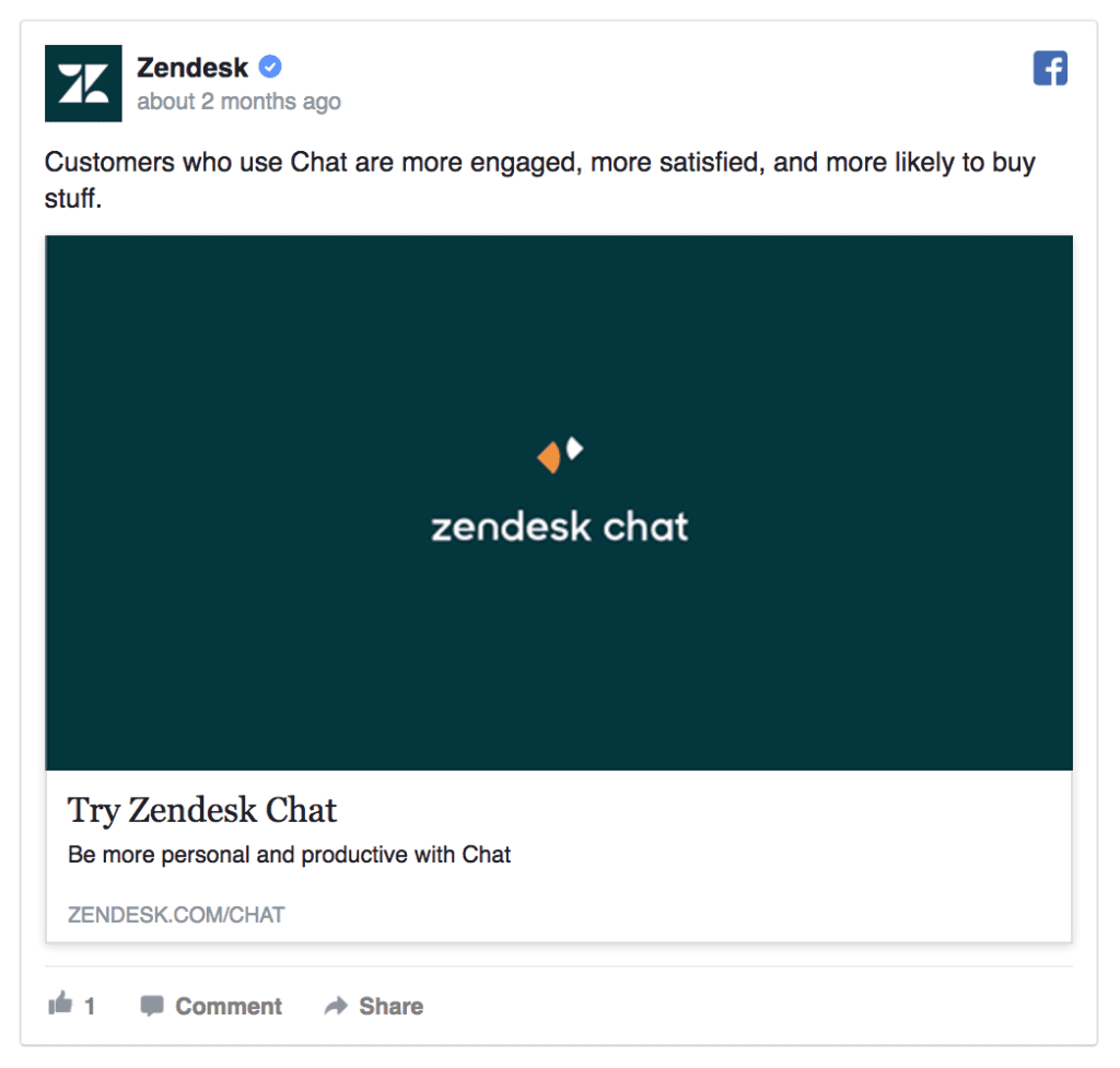
What makes this ad so good:
The striking minimalism of this ad makes sure people will immediately realize what the product and offer (Try Zendesk Chat) are about. This ad would make for a great remarketing ad for people already familiar with the brand.
#9: Google
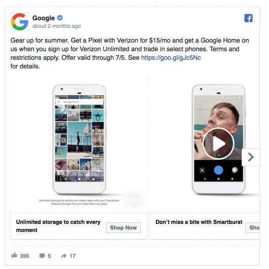
What makes this ad so good:
Did you know you can also add videos to your carousel ads? I’ve seen this approach work well for SaaS Facebook ads as it makes an otherwise boring product screenshot come to life.
#10: GoPro

What makes this ad so good:
If you’ve recently launched a new product, you could create a Facebook Custom Audience and advertise it to the existing customer base. How to get them to buy your newest product – offer a trade-up like GoPro.
Read more: How to Set Up Low-budget Facebook Ad Campaigns on Your Own
#11: Hootsuite

What makes this ad so good:
Limited-time offers create a sense of FOMO and make people act quicker (= more signups in a smaller timeframe). When advertising limited-time offers, make sure your campaign budget’s big enough to quickly reach all your audience members.
#12: Teabox
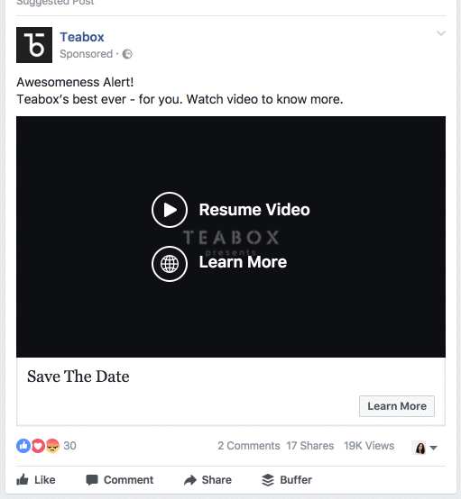
What makes this ad so good:
Teabox’s Facebook video ad example tells a story while also informing people about their upcoming sale. Presale countdown Facebook ads are a great way to build up some hype and get people to save the date.
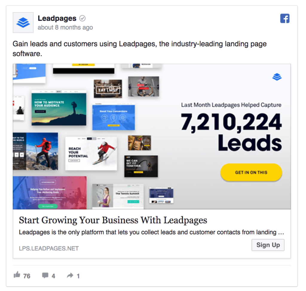
#13: Leadpages
What makes this ad so good:
If you’ve got some impressive numbers up on your sleeve, why not share these in your Facebook ad. From the no. of users to the no. of people benefitting from your product, mentioning them helps to create more trust in your brand.
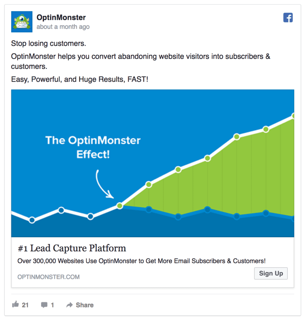
#14: OptinMonster
What makes this ad so good:
OptinMonster’s Facebook ad example gives a visual clue to the benefit of their product. This ad certainly caught my attention.
Tip: if you’re doubting between multiple image options, you can always do some Facebook A/B testing to find out what works best.
#15: AWeber

What makes this ad so good:
This Facebook ad isn’t trying to sell you anything. However, it’s asking people to take a fun survey and to submit their email to get their results. In the long term, this Facebook ad is bringing in many new email marketing leads – another interesting way of using Facebook ads as a PPC channel.
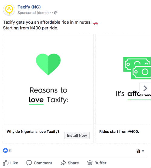
#16: Taxify
What makes this ad so good:
Instead of using stock images or screenshots, you can use design tools like Illustrator and Sketch to create a more visual representation of your product. If you consider how crowded Facebook newsfeed is with photos, using a custom design will help you get higher CTRs. And using speed lines wouldn’t hurt, either.
#17: Cobiro

What makes this ad so good:
Cobiro’s Facebook ad is mentioning two well-known brands and even using Google AdWords’ logo. The reason this works is that people will feel more positive about this small brand as they like the bigger brands mentioned.
However, be careful with using other brands’ logos in your ads – you actually need their permission to do so.
#18: IKEA
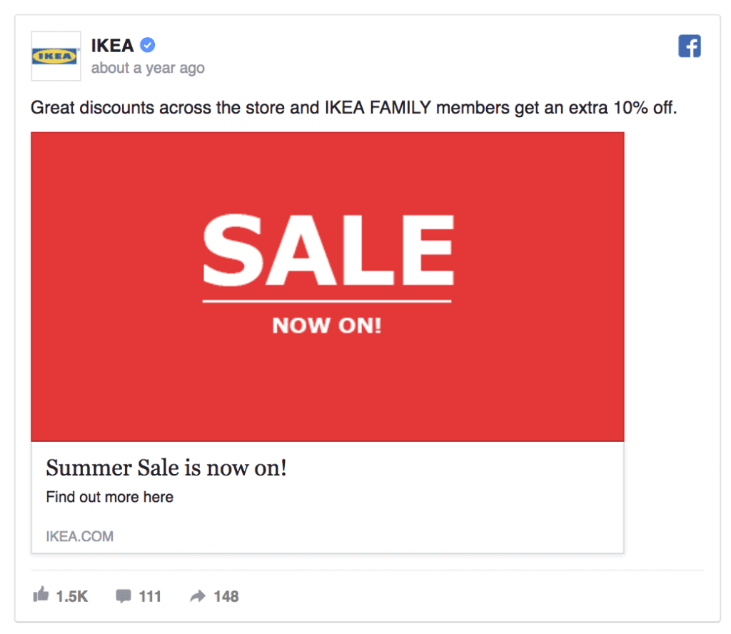
What makes this ad so good:
The next time you need to announce your sales, instead of creating a complex ad image, simply lay your message out on a blank colourful background. IKEA’s Facebook ad is stunning in its simplicity and efficiency.
#19: Lyft

What makes this ad so good: Well-chosen contrasting colours + straightforward in-image text. In addition, Lyft’s ad copy explains their offer more in detail for those interested.
#20: Soylent

What makes this ad so good: Soylent’s listing all their product’s benefits in the ad copy. You too can use emojis and symbols to add special characters in your ad copy.
Here are some to get you started: ➕ ➡ ✓
#21: GitHub
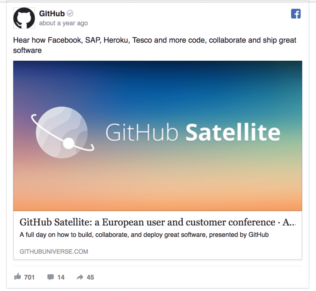
What makes this ad so good:
This Facebook ad example by GitHub is one of my favourite latest finds. Maybe it’s just me, but I find the gradient background perfect.
Read more: Instagram Ad Design and Copy – The Beginner’s Guide (2018 Update)
#22: SUMO

What makes this ad so good:
This ad looks like it’s part of a Facebook retargeting campaign promoting the the product to people who already tested SUMO’s products. If you’re able to create remarketing audiences of at least 100 people, it’s worth setting up a dedicated ad campaign.
#23: Venngage

What makes this ad so good:
This Facebook ad is sharing an industry report. But before people can download it, they’re asked to submit their email address. + Mentioning the year of your content helps to show it’s relevant NOW.
#24: Drip

What makes this ad so good:
In addition to mentioning the magical word FREE, this Facebook ad example by Drip features a happy-person-photo. All things considered, people will feel more positive about the offer and associate the email course with positive results. A similar approach would also work well in Instagram campaigns.
#25: Asana

What makes this ad so good:
I’ve always been a huge fan of Asana’s colourful Facebook ads – they catch your attention right then and there. When designing your Facebook ads, put it some extra effort as your ad’s image is arguably its most important element (it’s the first thing people will notice).
#26: Allsaints

#27: Happy Socks

What makes this ad so good:
Instead of just promoting their product, Happy Socks is adding a small discount to their offer, making it a lot more attractive to potential buyers. A similar ad could also be used as a remarketing ad – if a website visitor didn’t make a purchase on their first visit, you can offer them a discount to incentivize them to return.
#28: Inkbox

What makes this ad so good:
This Facebook ad copy delivers only the most important information. However, Inkbox’s ad text shows that they’ve perfectly understood their product’s key benefits for the customers.
#29: Adobe Stock

What makes this ad so good:
Another easy way to add a layer of branding on a stock photo is to darken the background image and place your logo over the image. This way, you’ll also increase people’s awareness of your logo.
#30: Cleanly

What makes this ad so good:
This Facebook ad reminds people of a common problem and offers a better solution. Using the “bad” and “good” comparison is a simple way to show people why your product’s beneficial to them.
#31: Hired
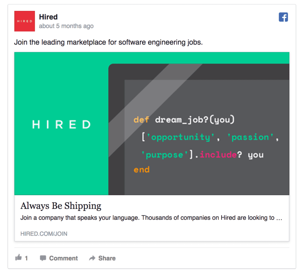
What makes this ad so good:
Hired’s Facebook ad example’s copy is actionable and tells exactly what people will get as they click on the ad.
#32: Kissmetrics

What makes this ad so good:
This Facebook ad example is all about the customer – you. “Get, keep, grow…” and other actionable verbs explain the products’ benefits. + the carousel’s symmetry is just spectacular.
#33: New Scientist
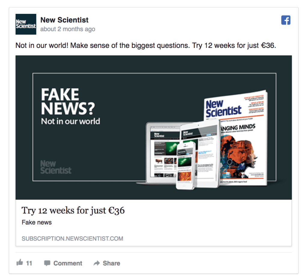
What makes this ad so good:
When selling subscription services, you might want to first offer people a free or discounted trial period. Once they’re happy with what they see, you can upsell.
#34: Bloomberg Business

What makes this ad so good:
This example is a little bit different from the rest as it’s a Facebook app install ad.
One of the best practices when promoting a mobile app is to include the name of your app in the ad image. Moreover, to make it clear to people it’s an app, advertisers can include the App Store icons in the design.
#35: Amazon

What makes this ad so good: While this Facebook ad has a really strange headline, it could serve well as a remarketing ad for people interested in this particular product or other toys.
#36: Square

What makes this ad so good:
Here’s another great example of Facebook carousel ad done right. Square is using the carousel’s cards to explain how their product works.
#37: HubSpot
This Facebook ad by HubSpot is a good example of the latest trend: placing the logo and simple text on a solid-color background.

What makes this ad so good:
The best way to inform people about a discount is to place the -X% sign in the Facebook ad image. Overall, using numbers in your Facebook ads is always a good idea.
#38: Heap

What makes this ad so good:
Heap’s Facebook ad is another good example of namedropping. One way to explain your new product to people is via another product they already know.
#39: Grammarly

What makes this ad so good:
Grammarly’s Facebook ad makes a big promise: “Your Life’s About to Change.” Using this copy in the headline is sure to spark many people’s curiosity.
#40: Google

What makes this ad so good:
Google’s Facebook ad is not really about their products. It’s about YOU. When creating ads, think about your customers instead of your product. What’s the unique value you can add to their lives?
#41: Dropbox

What makes this ad so good:
This Facebook ad mentions the size of Dropbox’s user base. If 90k people are already using it, it must be pretty good, right? When you’ve acquired enough customers, you can test a similar approach.
#42: Adidas

What makes this ad so good:
Here’s a great example of how to showcase your product in a simple yet creative way.
#43: Inbound.org

What makes this ad so good:
This Facebook ad example is noteworthy for two reasons: First, how many Facebook ads have you seen that combine black-and-white with bright colours? Second, the ad’s headline addresses directly their core audience – marketers. A more personalized approach is also preferred when creating highly converting ad campaigns.
#44: The Kooples

What makes this ad so good:
This is an example of Facebook dynamic product ads. Here’s how it works: you set up your product catalogue on Facebook and once a person views a particular item on your website, they’ll be shown a personalized retargeting ad with the very item. If you’re in eCommerce, this is your thing!
#45: MailChimp

What makes this ad so good:
In addition to being an amazing email marketing tool, MailChimp’s ads also beam with authenticity. Using a custom design for your Facebook ads is always a preferred option (compared to generic stock images).
See how to set up low-budget Facebook ad campaigns without using boring stock images.
#46: Sleeknote

What makes this ad so good:
Sleeknote’s Facebook ad promises quantifiable results, giving a better sense of how much their product can improve your marketing results.
#47: Asos

What makes this ad so good:
If you’re selling multiple products, use a carousel ad to show people all of them. Moreover, Asos’s ad is super simple, making a light and pleasant impression. Even the SALE sign isn’t too intrusive.
#48: Upwork
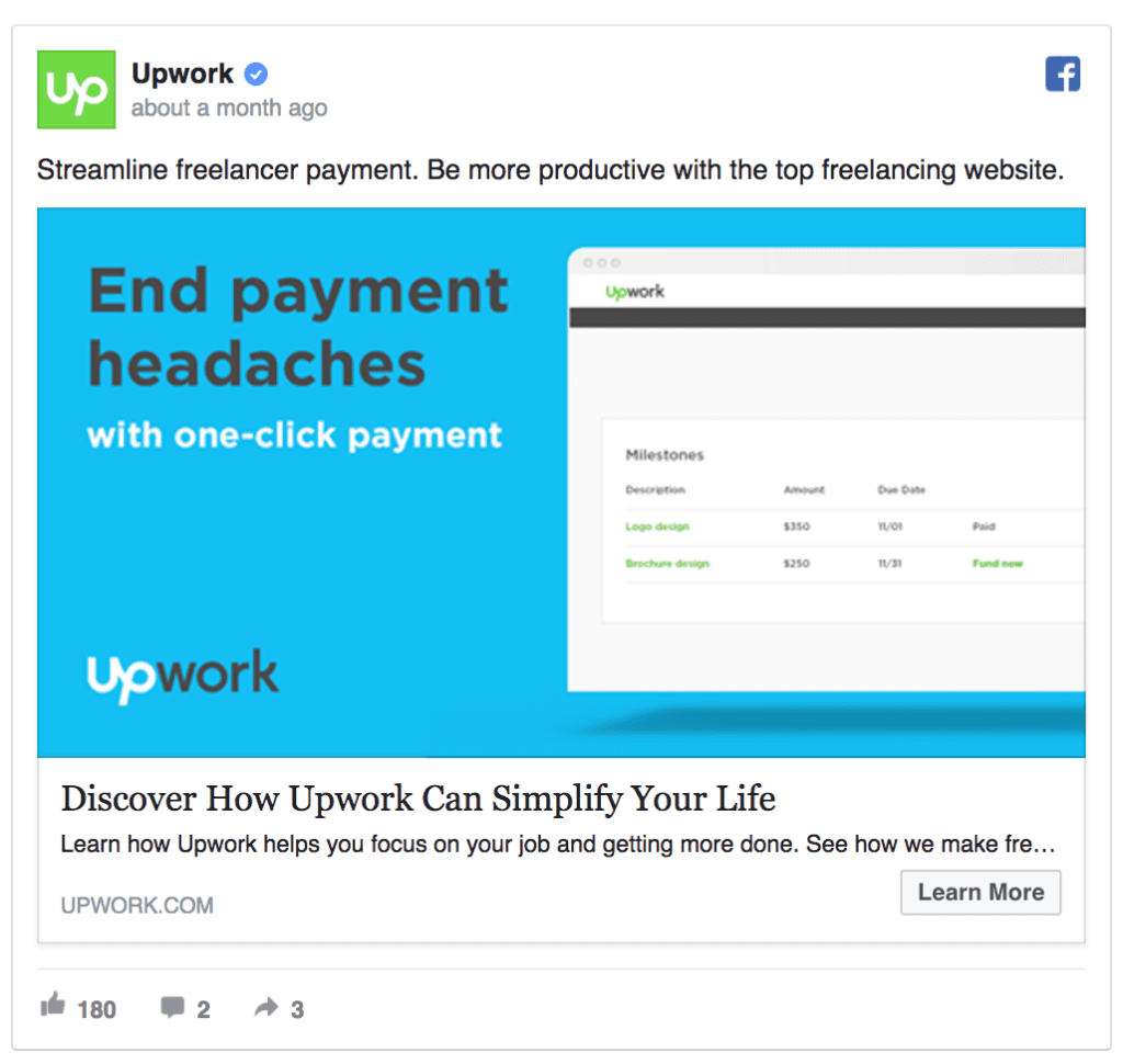
What makes this ad so good:
This Facebook ad by Upwork is also focusing on solving a problem for the customers. When writing your Facebook ad headlines, try to use an actionable verb such a “Get” “Try” “Discover” to nudge people to take that action.
#49: ZenHub

What makes this ad so good:
Lately, gradient’s made a comeback and is being used across websites, ads, and other branded material. If you haven’t tried a gradient Facebook ad yet, it’s time to do it.
#50: HubSpot

What makes this ad so good:
One way to get people read the full ad copy is to pose an interesting questions. HubSpot’s Facebook ad image asks “How well do you rank for SEO?” Now which marketers wouldn’t want to find out the answer?
#51: GetResponse

#52: GraphicStock

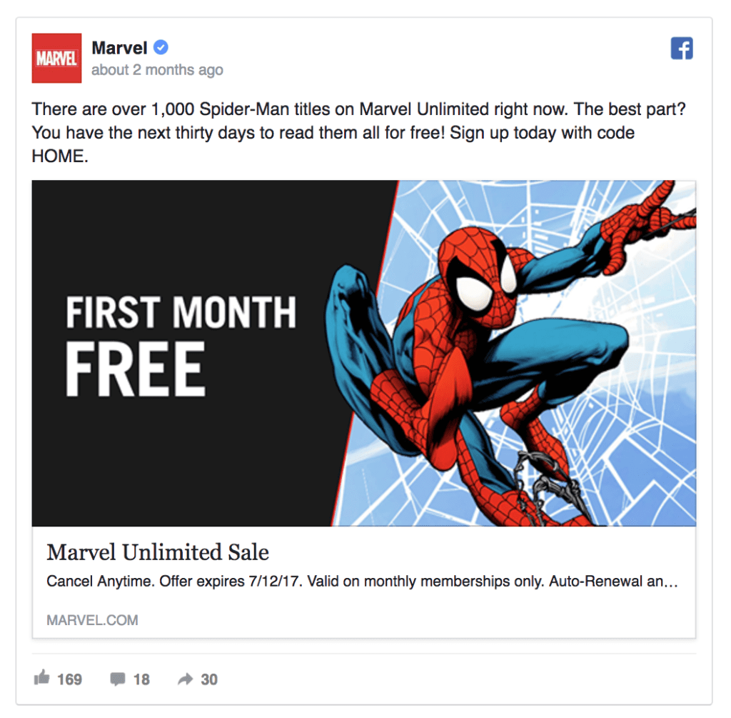
#53: Marvel
#54: Packlane

#55: Nike

#56: Trapica

#57: Yesware

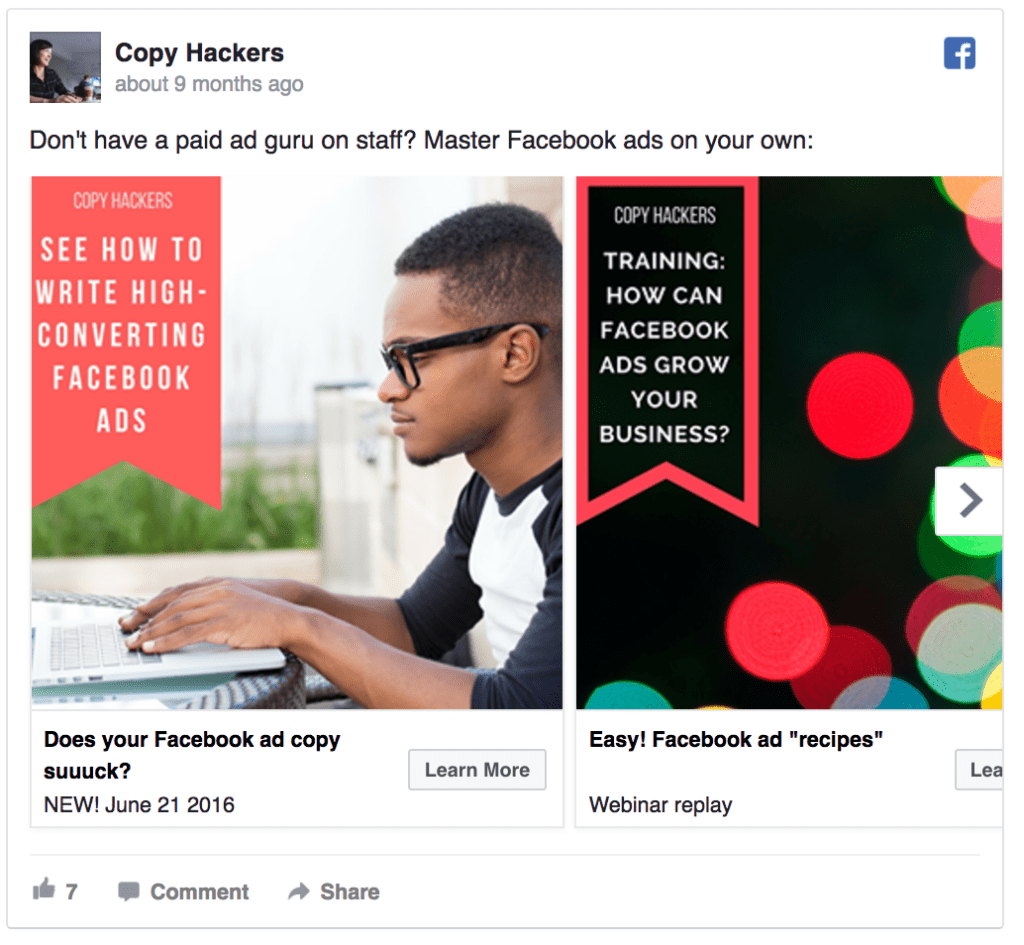
#58: Copy Hackers
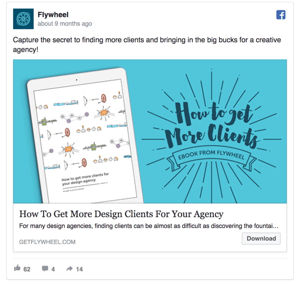
#59: Flywheel
#60: Leadpages

#61: Moz
#62: Sprinklr

#63: The Econimist

#64: Tubular

#65: WishLoop

#66: AppExchange

#67: AdStage

#68: Blue Bottle Coffee

#69: Groupon

#70: Harvest

#71: Google Cloud

#72: Krowdster

#73: Compass

#74: Drift

#75: Eventbrite

#76: CoSchedule

#77: Dell

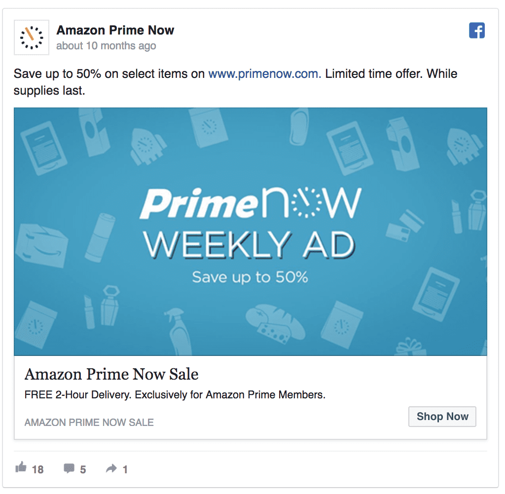
#78: Amazon Prime Now
#79: Autopilot
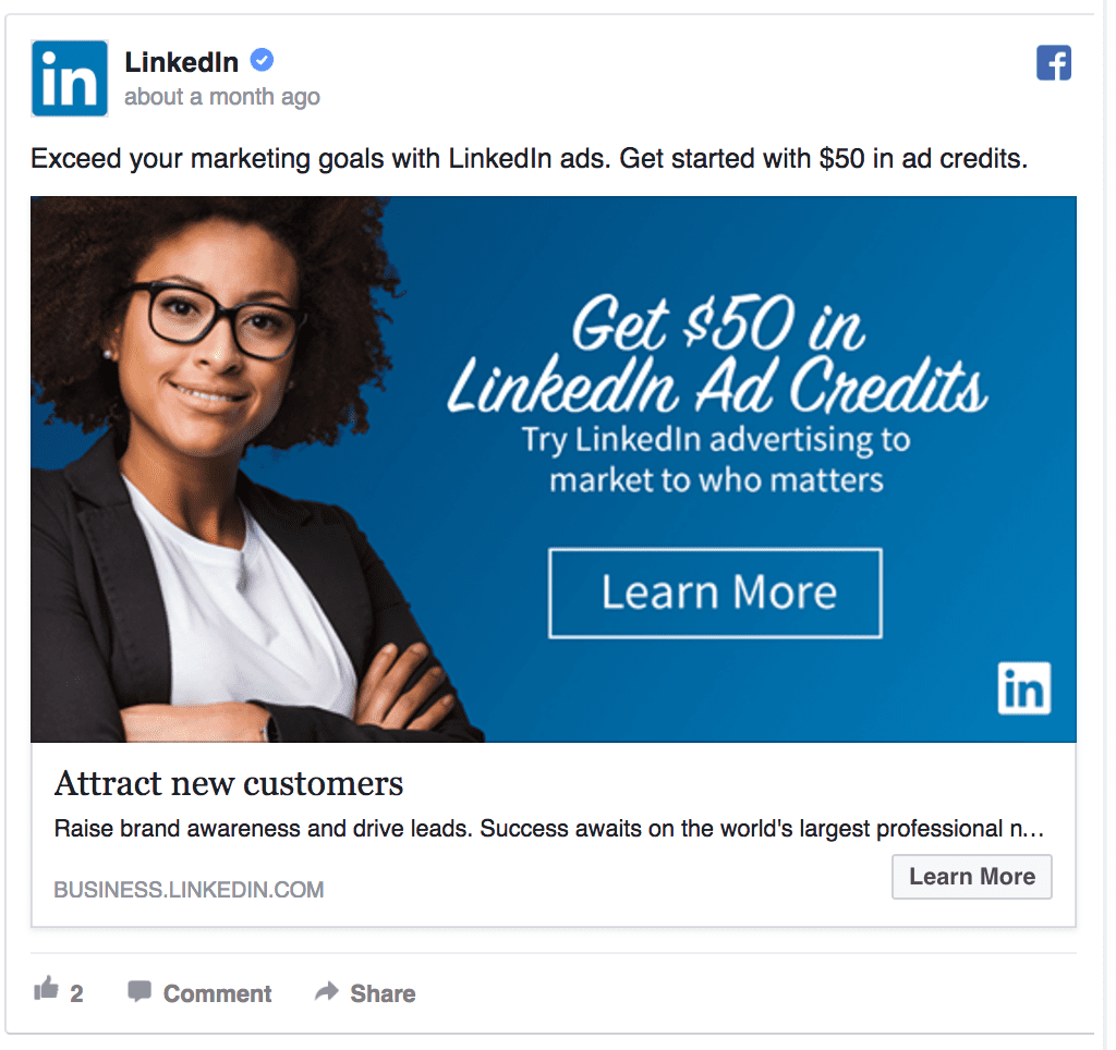
#80: LinkedIn
Aaand you’ve reached the end of this rundown.
If you’d like to see your company’s amazingly awesome Facebook ad examples featured in this list, reach out.